Stats basics (population, 5 sampling techniques, outlier definition): notes and practice questions
- Qualitative data is descriptive, non-numerical.
- Samples may not be representative of the entire population; minimise bias with random sampling.
- Stratified sampling divides the population into disjoint groups, then samples each group such that:
- The proportion sampled from a group equals the proportion of the population in that group.
- Quartiles divide data into four equal sections:
- : Splits the lowest 25%.
- (Median): Splits the lowest 50%.
- : Splits the lowest 75%.
- The Interquartile Range (IQR) measures the spread of the middle 50% of data:
- A value is an outlier if it falls outside these boundaries:
- Lower Boundary:
- Upper Boundary:
- Box plots display minimum, , median, , and maximum values.
- Outliers are explicitly marked with a cross ().
- Whiskers extend to the next smallest/largest value in the data set after any outliers are identified.
- Use a Graphical Display Calculator (GDC) to find quartiles and check outliers via its box plot function.
- A single sample might not perfectly represent the whole population.
- When drawing box plots with outliers, whiskers must stop at the next valid data point, not the outlier itself.
How it is examined
Cheap marks and easy marks to lose. Naming a sampling technique is one mark, and saying why it is or is not appropriate here is another, and the second needs a reference to the actual context. The outlier rule is applied numerically, so a question can ask a student to test a specific value against and . Take care with the word "random": simple random is one of the five named methods, not a synonym for unbiased.
- The concepts of population, sample, random sample, and discrete and continuous data.
- The reliability of data sources and bias in sampling.
- The interpretation of outliers.
- Sampling techniques and their effectiveness.
Linking questions
- Links to other subjects: descriptive statistics and random samples (biology, psychology, sports exercise and health science, environmental systems and societies, geography, economics, business management); research methodologies (psychology).
- Aim 8: misleading statistics, and problems caused by unrepresentative samples, for example the Google flu predictor, the 1936 US presidential election, the Literary Digest against George Gallup, the Boston "pot-hole" app.
- International-mindedness: the Kinsey report and its sampling techniques.
- TOK: why have mathematics and statistics sometimes been treated as separate subjects? How easy is it to be misled by statistics? Is it ever justifiable to use statistics to mislead deliberately?
Practice questions
23 questions · 15 medium · 8 hardQuestion 1
MediumPaper 1 · calculator8 marksA renowned artisanal bakery claims that only 5% of its specialty sourdough loaves have minor cosmetic imperfections (e.g., slight cracks, uneven browning). A local restaurant owner, who regularly purchases these loaves, decides to test this claim. For their latest delivery, the owner inspects a batch of 150 loaves and finds 12 loaves with cosmetic imperfections.
(a) Identify the type of sampling used by the restaurant owner.
(b) State the null and alternative hypotheses for this test.
(c) Calculate the p-value for this hypothesis test, assuming cosmetic imperfections occur independently.
(d) The restaurant owner performs the test at the 5% significance level. State the conclusion of the test, giving a reason.
Consider how the sample of loaves was chosen for inspection.
The null hypothesis represents the bakery's claim, while the alternative hypothesis reflects the restaurant owner's suspicion (that the proportion might be higher).
This is a binomial distribution problem. You need to calculate the probability of observing 12 or more imperfect loaves out of 150, given the null hypothesis.
Compare your calculated p-value with the given significance level to determine whether to reject or fail to reject the null hypothesis.
Question 2
HardPaper 2 · calculator22 marksA logistics company recorded the delivery times (in minutes) for a large batch of packages. The data is grouped in the frequency table below:
Delivery Time (minutes) | Frequency
---|---
|
|
|
|
|
|
|
|
|
|
(a) Calculate estimates of the mean and standard deviation of the delivery times.
(b) Construct a cumulative frequency table for the data, and use it to draw a cumulative frequency curve.
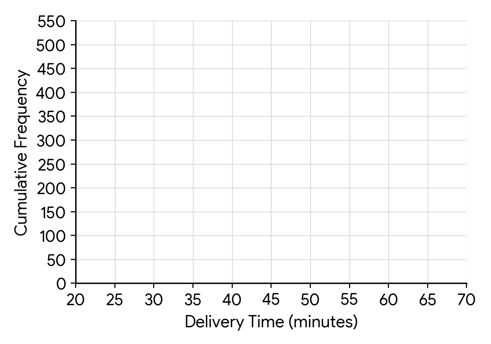
(c) Use your graph to estimate:
(i) the median delivery time
(ii) the lower and upper quartile of the delivery times
(iii) the interquartile range
(iv) the th percentile of delivery times.
(d) Draw a box-and-whisker plot of the data.
(e) Determine, with reasons, whether any customers could be considered outliers.
For grouped data, first find the midpoint of each class interval. Use these midpoints as the 'x' values for calculating the mean and standard deviation.
To construct the cumulative frequency table, add up the frequencies sequentially. When drawing the curve, plot the upper class boundary against the cumulative frequency.
The median corresponds to the 50th percentile. On the cumulative frequency curve, find the value on the x-axis that corresponds to 50% of the total frequency on the y-axis.
The lower quartile (Q1) is at 25% of the total frequency, and the upper quartile (Q3) is at 75% of the total frequency.
The interquartile range (IQR) is the difference between the upper quartile (Q3) and the lower quartile (Q1).
The 85th percentile corresponds to 85% of the total frequency.
Remember to include the minimum value, Q1, median, Q3, and maximum value. The whiskers extend to the minimum and maximum values that are not outliers.
Use the outlier rule: A data point is an outlier if it is less than or greater than . Consider the range of values within the extreme class intervals.
Question 3
MediumPaper 1 · calculator19 marks[Maximum mark: 19]
A tech company recorded the time (in minutes) 180 customers spent completing a new online feedback survey. The data was compiled into the following cumulative frequency graph.
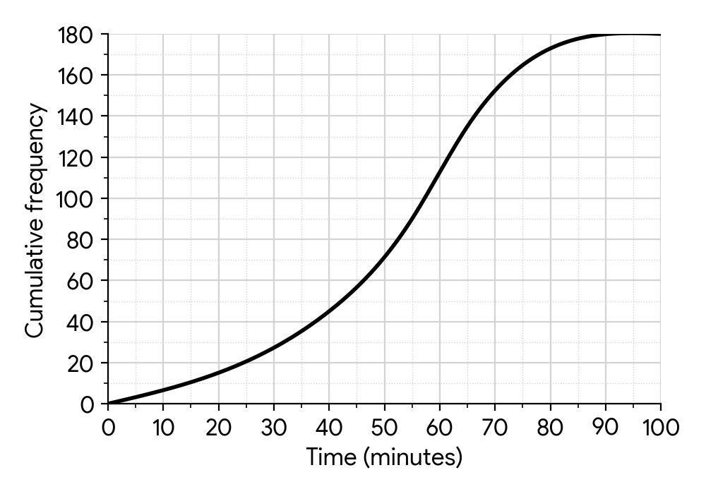
(a) Use the graph to find
(i) the median time;
(ii) the lower quartile;
(iii) the upper quartile;
(iv) the interquartile range.
Sarah completed the survey in 1.5 minutes.
(b) Determine whether Sarah's time is an outlier.
Remember to locate the correct cumulative frequency value for the median (50th percentile) before reading from the graph.
The lower quartile represents the 25th percentile of the data.
The upper quartile represents the 75th percentile of the data.
The interquartile range (IQR) is the difference between the upper quartile (Q3) and the lower quartile (Q1).
Recall the formula for identifying outliers: a data point is an outlier if it is less than Q1 - 1.5 IQR or greater than Q3 + 1.5 IQR.
Question 4
HardPaper 2 · calculator21 marksDr. Anya Sharma, a sports scientist, is investigating the relationship between training habits and performance in junior athletes. She wants to collect data on the weekly training hours of junior swimmers. She decides to interview every 5th swimmer entering the training facility until she has a sample of 50 swimmers.
State the sampling method Dr. Sharma has used.
Dr. Sharma constructed the following box and whisker diagram to show the weekly training hours (in hours) of a sample of junior swimmers.
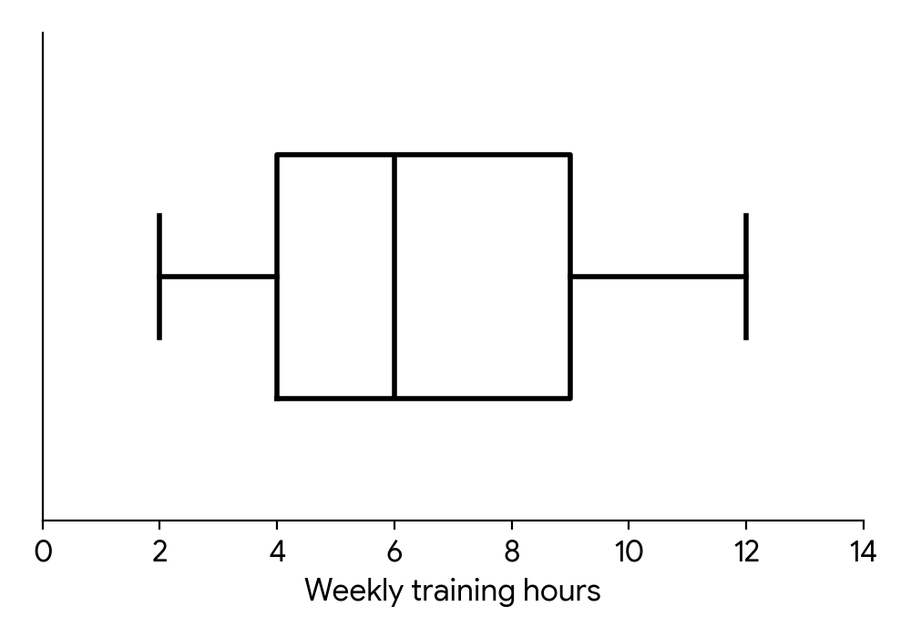
Write down the median weekly training hours.
Calculate the interquartile range for the weekly training hours.
One swimmer in the sample reported training for 15 hours per week. Dr. Sharma believes this swimmer's training time is not an outlier.
Determine whether Dr. Sharma is correct. Support your reasoning.
Dr. Sharma also collected data on the average weekly training hours () and the competition score () for a group of athletes. These data are represented on the scatter diagram.
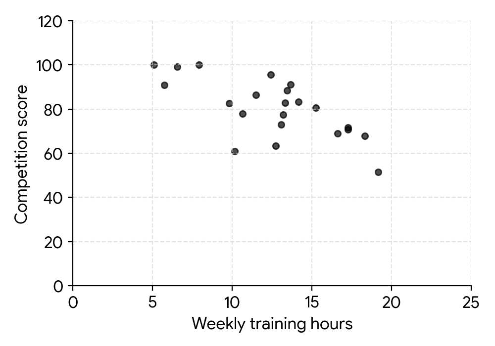
Describe the correlation between weekly training hours and competition score.
Dr. Sharma correctly calculates the equation of the regression line on for these athletes to be . She uses the equation to estimate the competition score for an athlete who trains 3 hours per week.
Find the competition score calculated by Dr. Sharma.
State whether it is valid to use the regression line on for Dr. Sharma's estimate in part (f). Give a reason for your answer, assuming the original data for training hours ranged from 5 to 20 hours.
Dr. Sharma investigated the relationship between an athlete's national competition rank and their average daily protein intake (in grams). She collected data for eight athletes, as shown in the table.
| Athlete | A | B | C | D | E | F | G | H |
|---|---|---|---|---|---|---|---|---|
| Competition Rank () | 1 | 2 | 3 | 4 | 5 | 6 | 7 | 8 |
| Protein Intake (g) () | 180 | 150 | 200 | 160 | 140 | 190 | 170 | 130 |
Dr. Sharma intends to analyse the data using Spearman's rank correlation coefficient, .
Copy and complete the information in the following table.
| Athlete | A | B | C | D | E | F | G | H |
|---|---|---|---|---|---|---|---|---|
| Rank - Competition Rank | 1 | |||||||
| Rank - Protein Intake |
Calculate the value of .
Interpret your result.
Consider how the sample is selected. Is there a systematic rule applied, or is it based on categories and targets?
The median is represented by the line inside the box of a box and whisker diagram.
The interquartile range (IQR) is the difference between the third quartile (Q3) and the first quartile (Q1).
An outlier is typically defined as a data point that falls more than 1.5 times the interquartile range (IQR) below the first quartile (Q1) or above the third quartile (Q3). Calculate the upper and lower fences.
Observe the general trend of the points on the scatter diagram. Do they tend to go up or down from left to right?
Substitute the given value of into the regression equation to find the corresponding value.
Consider if the value used for prediction falls within the range of the original data used to create the regression line.
Assign ranks to the 'Protein Intake' values. If 'Competition Rank' is already ranked from 1 to 8 (best to worst), then for 'Protein Intake', assign rank 1 to the highest intake, rank 2 to the next highest, and so on.
Use the formula for Spearman's rank correlation coefficient: , where is the difference between the ranks and is the number of data pairs.
Consider the sign and magnitude of . What does a positive or negative value mean, and what does a value close to 0 or 1 (or -1) indicate about the strength of the relationship?
Question 5
MediumPaper 2 · calculator15 marksA fitness enthusiast, Alex, recorded the number of steps (in hundreds) he took each day over a period of days. The data is given below in ascending order:
(a) Find the median number of steps.
(b) Find the lower quartile (Q1).
(c) Find the upper quartile (Q3).
(d) Find the range of the data.
(e) Determine whether there are any outliers in the data.
(f) Draw a box-and-whisker diagram for the above data, marking any outliers as required.
The median is the middle value of an ordered dataset. For an even number of data points, it's the average of the two middle values.
The lower quartile (Q1) is the median of the lower half of the data. For an even number of data points in the lower half, average the two middle values.
The upper quartile (Q3) is the median of the upper half of the data. For an even number of data points in the upper half, average the two middle values.
The range is the difference between the maximum and minimum values in the dataset.
An outlier is a data point that falls outside the interval . First, calculate the Interquartile Range (IQR).
A box-and-whisker diagram requires five key values: minimum non-outlier, Q1, median, Q3, and maximum non-outlier. Outliers are marked separately.
Question 6
HardPaper 2 · calculator19 marksA manufacturing company inspects the first 50 items produced each morning for defects.
(a) State the sampling method being used.
The company uses an automated machine to test products for defects. This machine is not perfect.
It is known that 3% of all products manufactured are defective (D).
If a product is defective, the machine correctly identifies it as defective (tests positive, ) 98% of the time.
If a product is not defective (D'), the machine incorrectly identifies it as defective (tests positive, ) 1% of the time.
The tree diagram shows some of this information.
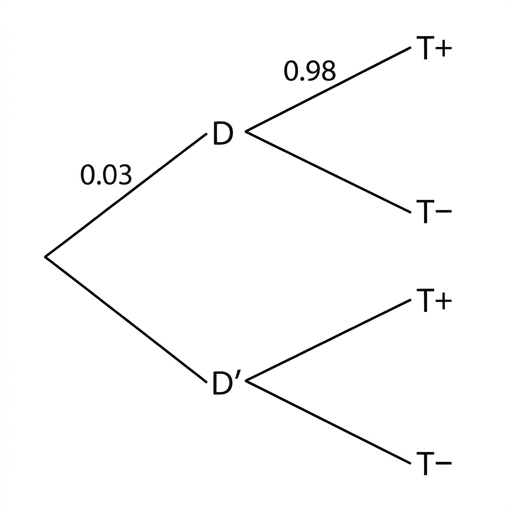
(b) (i) Write down the value of .
(ii) Write down the value of .
(iii) Write down the value of .
(iv) Write down the value of .
(c) Use the tree diagram to find the probability that a randomly selected product:
(i) is not defective and tests positive.
(ii) tests negative.
(iii) is defective given that it tested negative.
(d) The company finds the actual number of defective products in their sample is different than predicted by the tree diagram. Explain why this might be the case.
(e) The factory manager surveyed all employees on a particular shift. All employees on this shift worked in at least one of these departments: Assembly (A), Painting (P), or Quality Control (Q). It was found that:
- 85 employees worked in Assembly;
- 55 employees worked in Painting;
- 35 employees worked in Quality Control;
- 10 employees worked in all three departments;
- 20 employees worked in Assembly and Quality Control but not Painting;
- 15 employees worked in Assembly and Painting but not Quality Control;
- 4 employees worked only in Quality Control.
Draw a Venn diagram to illustrate this information, placing all relevant information on the diagram.
(f) Find the total number of employees on this shift.
Consider how the sample is chosen. Is it completely random, or is there a specific, non-random criterion for selection?
The sum of probabilities for all possible outcomes at any branch point must be 1.
The sum of probabilities for all possible outcomes at any branch point must be 1. If is given, how can you find ?
This value is directly given in the problem description.
The sum of probabilities for all possible outcomes at any branch point must be 1. If is given, how can you find ?
To find the probability of two independent events both occurring, multiply their individual probabilities.
A product can test negative in two ways: it is defective and tests negative, or it is not defective and tests negative. Sum these probabilities.
This is a conditional probability problem. Recall Bayes' Theorem: .
Consider the nature of the sampling method used and how it relates to the entire population of products.
Start by filling in the innermost region (the intersection of all three sets) and then work outwards to the two-set intersections and single-set regions. Remember that 'only' means not in any other specified set.
Sum the numbers in all the distinct regions of your Venn diagram.
Question 7
MediumPaper 1 · calculator12 marks(a) State whether the following set of data is discrete or continuous, and, in each case, construct a frequency table.
The number of cars passing a specific checkpoint in 10-minute intervals during rush hour:
(b) State whether the following set of data is discrete or continuous, and, in each case, construct a frequency table using appropriate class intervals.
The heights of saplings (in cm) in a plant nursery:
(c) State whether the following set of data is discrete or continuous, and, in each case, construct a frequency table.
The number of correct answers on a 10-question multiple-choice quiz for a group of students:
Consider if the data can take any value within a range or only specific, separate values. For the frequency table, count how many times each unique value appears.
Heights can take any value within a range, suggesting continuous data. For the frequency table, you'll need to group the data into intervals, for example, of 3 cm.
Think about whether you can have a fractional number of correct answers. Then, count the occurrences of each score.
Question 8
HardPaper 2 · calculator15 marksA quality control manager at a manufacturing plant wants to assess the consistency of a new batch of electronic components. He decides to test ten components, ensuring that five are selected from Production Line A and five from Production Line B. The manager instructs the supervisors of each line to provide the required number of components from their current production.
(a) Name the type of sampling that best describes the method used by the quality control manager.
The weights, in grams, of the ten components selected for the test are:
.
(b) For these ten components, find
(i) the mean weight.
(ii) the standard deviation of the weights.
The target weight for these components is g. The manager is concerned that the components might be consistently underweight. Perform an appropriate test at the significance level to see if the mean weight of the components produced is less than the target weight. It can be assumed that the weights come from a normal population.
State one reason why the test performed in part (c) might not be valid.
Two additional components are tested at a later date. The mean weight for all twelve components is g and the standard deviation is g.
For further analysis, a 'quality score' for the twelve components is obtained by multiplying the weights by and subtracting .
(e) For the twelve components, find
(i) their mean quality score.
(ii) the standard deviation of their quality score.
Consider how the sample is structured based on characteristics (like production line) and how the specific units are chosen within those structures.
To find the mean, sum all the weights and divide by the number of components.
Use a GDC for efficient calculation of standard deviation. Ensure you are using the sample standard deviation if the context implies the sample is used to estimate a population, or population standard deviation if the sample is the entire population of interest.
Formulate null and alternative hypotheses. Since the population standard deviation is unknown and the sample size is small, a t-test is appropriate. Use your GDC to find the p-value and then compare it to the significance level.
Consider the method used to select the components for testing and whether it truly represents the entire production.
When data is transformed linearly by , the new mean is .
When data is transformed linearly by , the new standard deviation is .
Question 9
MediumPaper 2 · calculator10 marksThe scores (out of 100) for 28 students on a recent mathematics test were recorded as follows:
(a) Find the mean score of the students.
(b) Find the median score of the students.
(c) Find the interquartile range.
(d) The score of another student was added to the data but found to be an outlier.
Find the least possible score this new student could have, given that it is higher than each of the others.
To find the mean, sum all the scores and divide by the total number of students.
First, ensure the data is sorted. For an even number of data points, the median is the average of the two middle values.
The interquartile range (IQR) is the difference between the upper quartile (Q3) and the lower quartile (Q1). For an even dataset, Q1 is the median of the lower half, and Q3 is the median of the upper half.
An outlier is defined as a value that is more than 1.5 times the IQR above Q3 or below Q1. Since the outlier is higher, use the upper bound formula: .
Question 10
HardPaper 2 · calculator21 marksThe lifespans, , of 250 LED light bulbs are recorded in the following table.
| Lifespan (hours) | Frequency |
|---|---|
| 20 | |
| 60 | |
| 90 | |
| 55 | |
| 25 |
This table is used to create a cumulative frequency graph.
Write down the mid-interval value of the class .
Calculate an estimate of the mean lifespan of the 250 light bulbs.
Use the cumulative frequency curve (which would be provided in an exam) to estimate the interquartile range. Assume the lower quartile () is hours and the upper quartile () is hours.
A light bulb from the data set had a lifespan of hours.
Use your answer to part (b) to estimate whether this light bulb's lifespan is an outlier for this data. Justify your answer.
It is believed that the lifespans of these LED light bulbs follow a normal distribution with mean hours and standard deviation hours.
It is decided to perform a goodness of fit test on the data to determine whether this sample of 250 light bulbs could have plausibly been drawn from an underlying distribution .
Write down the null and the alternative hypotheses for the test.
As part of the test, the following table is created.
| Lifespan of light bulb (hours) | Observed frequency | Expected frequency |
|---|---|---|
| 20 | 14.0 | |
| 60 | 60.1 | |
| 90 | a | |
| 55 | 60.1 | |
| 25 | b |
Find the value of and the value of . Give your answers to one decimal place.
Hence, perform the test to a 5% significance level, clearly stating the conclusion in context.
The mid-interval value is the average of the lower and upper bounds of the class interval.
To estimate the mean from grouped data, multiply each mid-interval value by its corresponding frequency, sum these products, and then divide by the total frequency.
The interquartile range (IQR) is the difference between the upper quartile () and the lower quartile ().
An outlier is typically defined as a value that is more than below or above . Calculate the upper bound for outliers.
The null hypothesis () usually states that there is no difference or that the data fits the proposed model. The alternative hypothesis () states that there is a difference or the data does not fit the model.
For a normal distribution , the probability can be found using the cumulative distribution function (CDF), . Then, multiply this probability by the total number of observations to get the expected frequency.
Calculate the Chi-squared test statistic using the formula . Then find the p-value using the degrees of freedom (). Compare the p-value to the significance level to draw a conclusion.
Question 11
MediumPaper 1 · calculator8 marksP1: The box-and-whisker diagram below illustrates the daily screen time (in hours) for a sample of teenagers.
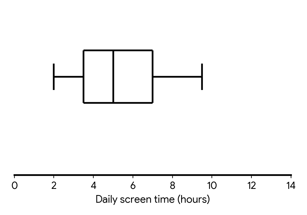
(a) Find the range of daily screen times.
(b) Find the interquartile range (IQR) of daily screen times.
(c) Find the percentage of teenagers who spend between and hours on screen time daily.
(d) A new survey participant reported spending hours on screen time daily.
Determine whether this time would be counted as an outlier.
The range is the difference between the maximum and minimum values in the data set.
The interquartile range (IQR) is the difference between the upper quartile (Q3) and the lower quartile (Q1).
Recall what each section of a box-and-whisker diagram represents in terms of percentage of data.
An outlier is typically defined as a data point that falls below Q1 - 1.5 IQR or above Q3 + 1.5 IQR.
Question 12
HardPaper 2 · calculator21 marks(a) The scores, , of 200 students on a mathematics test are recorded in the following table.
| Score () | Frequency |
|---|---|
| 15 | |
| 35 | |
| 60 | |
| 50 | |
| 30 | |
| 10 |
(i) Write down the mid-interval value of .
(ii) Calculate an estimate of the mean score of the 200 students.
(b) The data from this table is used to create a cumulative frequency graph. From this graph, the first quartile () is estimated to be and the third quartile () is estimated to be .
Use these values to estimate the interquartile range (IQR).
(c) A student, Elara, scored on the test.
Use your answer to part (b) to estimate whether Elara's score is an outlier for this data. Justify your answer.
(d) It is believed that the scores of students on this mathematics test follow a normal distribution with mean and standard deviation .
It is decided to perform a goodness of fit test on the data to determine whether this sample of 200 students could have plausibly been drawn from an underlying distribution .
Write down the null and the alternative hypotheses for the test.
(e) As part of the test, the following table is created, where some categories have been combined to ensure expected frequencies are not too low.
| Score () | Observed Frequency | Expected Frequency |
|---|---|---|
| 15 | 6.08 | |
| 35 | 32.08 | |
| 60 | a | |
| 50 | 63.99 | |
| 40 | b |
(i) Find the value of and the value of .
(ii) Hence, perform the test to a 5% significance level, clearly stating the conclusion in context.
The mid-interval value is the average of the lower and upper bounds of the interval.
To estimate the mean from grouped data, multiply each mid-interval value by its frequency, sum these products, and then divide by the total number of students.
The interquartile range (IQR) is the difference between the third quartile () and the first quartile ().
An outlier is typically defined as a value that is more than below or above . Calculate the upper and lower bounds for outliers.
The null hypothesis () states that there is no significant difference, while the alternative hypothesis () states that there is a significant difference. Make sure to reference the specific distribution parameters.
(i) Use the normal distribution to calculate the probabilities for the given intervals and multiply by the total number of students (200) to find the expected frequencies.
(ii) Calculate the statistic and the p-value. The degrees of freedom for a goodness-of-fit test when parameters are given is (number of categories - 1). Compare the p-value to the significance level to draw a conclusion.
Question 13
MediumPaper 1 · calculator10 marksDefine, as fully as you can, the terms random sampling, stratified sampling, and systematic sampling.
A large university wants to conduct a survey to understand student satisfaction with the campus library services. The university initially considers using systematic sampling by selecting every 50th student from an alphabetical list of all enrolled students.
Suggest one reason why this method might not be appropriate for surveying student satisfaction with library services.
The research team is now considering either random sampling or stratified sampling. Determine which of these two methods would be more appropriate for this investigation. Justify your answer.
Recall the key characteristics and procedures for each sampling method. Think about how samples are selected from the population in each case.
Consider potential biases or lack of representativeness that could arise from using an alphabetical list and a fixed interval, especially in a diverse university setting.
Think about the diversity of the student body (undergraduate, postgraduate, distance learning) and how each sampling method would handle this diversity. Which method ensures that all relevant groups are adequately represented?
Question 14
HardPaper 3 · calculator24 marksMs. Anya Sharma, a school principal, wants to investigate if the number of hours students spend studying affects their exam scores. This question asks you to review Ms. Sharma's methods and conclusions.
Ms. Sharma obtained a list of students from her school. She contacted them and asked them to fill in an anonymous questionnaire. Participants were asked to state their weekly study hours and their most recent exam score (out of 100). Of the 250 students on the list, 11 replied.
Ms. Sharma's results are summarized in the following table:
| Student ID | Weekly Study Hours (X) | Exam Score (Y) |
|---|---|---|
| 1 | 5 | 50 |
| 2 | 7 | 65 |
| 3 | 8 | 60 |
| 4 | 10 | 78 |
| 5 | 12 | 70 |
| 6 | 6 | 55 |
| 7 | 9 | 72 |
| 8 | 11 | 80 |
| 9 | 4 | 45 |
| 10 | 13 | 85 |
| 11 | 18 | 60 |
Describe one way in which Ms. Sharma could improve the reliability of her investigation.
Describe one criticism that can be made about the validity of Ms. Sharma's investigation.
Ms. Sharma classifies Student 11 as an outlier and removes their data from the analysis. Suggest one possible justification for her decision to remove it.
For the remaining ten student responses in the table, Ms. Sharma calculates the mean exam score to be . Calculate the mean weekly study hours for these remaining responses.
Determine the value of , Pearson's product-moment correlation coefficient, for these remaining responses.
Ms. Sharma decides to carry out a hypothesis test on the correlation coefficient to investigate whether increased weekly study hours are associated with higher exam scores. State why the hypothesis test should be one-tailed.
State the null and alternative hypotheses for this test.
The critical value for this test, at the 5% significance level, is 0.549. Ms. Sharma assumes that the population is bivariate normal. Determine whether there is significant evidence of a positive correlation between weekly study hours and exam scores. Justify your answer.
Ms. Sharma wants to create a model to predict how changing weekly study hours might affect exam scores. To do this, she assumes that weekly study hours, , is the independent variable and the exam score, , is the dependent variable.
She first considers a linear model of the form . Use Ms. Sharma's data to find the value of and of .
Interpret, referring to study hours and exam scores, what the value of represents.
Ms. Sharma then considers a quadratic model of the form . Find the value of , of and of .
Find the coefficient of determination for each of the two models she considers.
Hence compare the two models.
Ms. Sharma decides to use the coefficient of determination to choose between these two models. Comment on the validity of her decision.
After presenting the results of her investigation, a colleague questions whether Ms. Sharma's sample is representative of all students in the school. A report states that the mean weekly study hours for all students in the school is hours. Ms. Sharma decides to carry out a test to determine whether her sample could realistically be taken from a population with a mean of hours. State the name of the test which Ms. Sharma should use.
State the null and alternative hypotheses for this test.
Perform the test, using a 5% significance level, and state your conclusion in context.
Reliability concerns the consistency and repeatability of the results. How can she ensure her measurements are more consistent or less prone to random error?
Validity concerns whether the study measures what it intends to measure and whether the results are generalizable. Are there other factors influencing exam scores? Is "study hours" accurately measured?
Look at the data for Student 11 compared to the general trend. What makes it unusual?
Sum the weekly study hours for the remaining students and divide by .
Use your GDC's statistical functions to calculate Pearson's for the data points (excluding Student 11).
Consider the specific direction of the relationship Ms. Sharma is investigating.
The null hypothesis typically states no effect or no relationship, while the alternative hypothesis states the effect or relationship you are looking for. Use the correct symbol for population correlation.
Compare your calculated value from part (c.ii) with the given critical value.
Use your GDC's linear regression function (LinReg(ax+b) ) with the data points.
The coefficient in a linear model represents the change in for every one-unit increase in .
Use your GDC's quadratic regression function (QuadReg) with the data points.
The coefficient of determination, , is often provided by your GDC along with the regression equation. For the linear model, .
A higher value generally indicates a better fit for the data.
tends to increase with the number of independent variables or parameters in a model, even if the additional terms do not significantly improve the model's predictive power.
This is a test comparing a sample mean to a known population mean when the population standard deviation is unknown (which is usually the case).
The null hypothesis assumes the sample comes from the population with the stated mean. The alternative hypothesis states it does not.
Use your GDC's t-test function (T-Test) for one sample. Input the sample data (study hours), the hypothesized population mean, and the significance level.
Question 15
MediumPaper 1 · calculator4 marksThe student body of Horizon University consists of students.
A research team conducted a survey on student preferences for learning methods, selecting a random sample of students.
In this sample, students indicated a preference for online learning over traditional in-person classes.
Calculate an estimate for the total number of students at Horizon University who prefer online learning.
The research team decided to conduct a follow-up survey, but this time they opted for a stratified sample instead of a simple random sample.
Suggest two possible types of strata (apart from learning method preference) that would be sensible for the research team to use in their follow-up survey.
Consider the proportion of students who prefer online learning in the sample and apply it to the total student population.
This part provides context for the next question. No calculation or specific answer is required here.
Think about characteristics that might influence a student's learning preferences or experiences at a university, other than their current preference.
Question 16
HardPaper 3 · calculator28 marks(a) TechInnovate is considering collecting more data for their analysis.
(i) State one advantage of increasing the sample size.
(ii) State one disadvantage of increasing the sample size.
(b) The production manager at Plant Alpha recorded the time, in minutes, taken to produce a batch of electronic components for 10 randomly selected batches:
Find the value of for this sample from Plant Alpha.
(c) A manager claims that Plant Alpha's production times are more consistent than Plant Beta's. Given that the sample standard deviation () for Plant Beta's production times is minutes, make one criticism of this claim.
(d) TechInnovate wants to compare the mean production times of Plant Alpha and Plant Beta using a pooled t-test.
(i) State the condition regarding population variances required to use a pooled t-test.
(ii) Given that for Plant Beta, a sample of batches yielded a mean production time of minutes and a sample standard deviation of minutes, state whether TechInnovate should use a pooled t-test in this case. Justify your answer.
(e) TechInnovate believes Plant Alpha has a lower mean production time than Plant Beta.
(i) State appropriate null and alternative hypotheses for the pooled t-test.
(ii) Find the p-value.
(iii) Given that the test is carried out at the 5% significance level, state the appropriate conclusion in context. Justify your answer.
(f) The company also investigates the relationship between operator experience (in years) and the number of defective items produced per day. A sample of 8 operators yielded the following data:
| Operator Experience (years) | Number of Defective Items |
|---|---|
| 2 | 15 |
| 5 | 10 |
| 3 | 13 |
| 8 | 7 |
| 1 | 18 |
| 6 | 9 |
| 4 | 12 |
| 7 | 8 |
(i) Assuming all requirements are met, perform a test at the 5% significance level to determine if there is a linear correlation between operator experience and the number of defective items. State the hypotheses and justify your conclusion.
(ii) If the requirements for this test are not met, state an alternative test that could be used.
(g) For the data in (f.i), the equation of the least squares regression line of defective items () on operator experience () is . Give, in context, an interpretation of the gradient in this model.
(h) TechInnovate uses a baseline model to predict the number of defective items () for a batch based on its size (): . The "Quality Deviation" () for a batch is defined as . A positive Quality Deviation indicates better-than-expected quality.
(i) Show that for a batch of components from Plant Beta that produced defective items, the Quality Deviation is .
(ii) To compare quality control, samples of Quality Deviation scores were collected:
- Plant Alpha: , ,
- Plant Beta: , ,
Assuming that the appropriate requirements are met, use a pooled t-test at a 5% significance level to determine if the mean Quality Deviation is higher in Plant Alpha than in Plant Beta. Write down your null and alternative hypotheses and justify your conclusion.
(i) Using the results from parts (e) and (h.ii), explain how each plant could claim they are performing better than the other plant.
Think about how a larger sample relates to the overall population.
Consider the practical implications of collecting more data.
Use your GDC to calculate the sample standard deviation ( or ).
Consider the nature of sample statistics versus population parameters, especially when values are close.
Recall the assumption about variances for a pooled t-test.
Compare the sample standard deviations of Plant Alpha (from part b) and Plant Beta.
Remember to define your parameters and specify the direction of the alternative hypothesis.
Use your GDC to perform a two-sample t-test with pooled variance, then adjust for the one-tailed hypothesis.
Compare the p-value with the significance level and relate it back to the original claim about production times.
Calculate the Pearson product-moment correlation coefficient () and its associated p-value. Formulate hypotheses for population correlation ().
Consider non-parametric alternatives for correlation when assumptions for Pearson's are violated.
The gradient represents the change in the dependent variable for a one-unit change in the independent variable.
First, calculate the predicted number of defective items using the model. Then, apply the definition of Quality Deviation.
Formulate hypotheses for the population mean Quality Deviation. Perform a one-tailed pooled t-test using your GDC.
Review the conclusions of the two t-tests. One test might favor Plant Alpha, while the other might not show a significant difference, which Plant Beta could use to their advantage.
Question 17
MediumPaper 2 · calculator18 marksA cognitive science researcher recorded the completion times, in seconds, for 30 participants solving a complex spatial puzzle. The data collected is as follows:
(a) Calculate the mean and standard deviation of the completion times. Comment on what these values indicate about the data.
(b) Determine the smallest value, the largest value, and the range of the completion times.
(c) Find the lower quartile (), median, and upper quartile (). Hence, calculate the interquartile range (IQR) and determine if there are any outliers in the data, justifying your answer.
(d) Draw a box-and-whisker plot for the data, clearly indicating any outliers.
Use your GDC to calculate the mean and standard deviation. Remember to use the sample standard deviation. For the comment, consider what the mean tells you about the average performance and what the standard deviation tells you about the spread of the data.
The range is the difference between the largest and smallest values in the dataset.
For discrete data, the quartiles can be found by locating specific positions in the ordered dataset. Remember the formula for outliers: values below or above .
Remember to label your axis and include a suitable scale. The whiskers extend to the smallest and largest values that are not outliers. Outliers are typically marked with a cross or asterisk.
Question 18
MediumPaper 1 · calculator10 marksA farmer recorded the weights of 16 pumpkins harvested from his field. The five-number summary (excluding any outliers) and one outlier are given as follows:
Minimum weight: kg
Lower Quartile (): kg
Median (): kg
Upper Quartile (): kg
Maximum weight (excluding outlier): kg
One outlier was recorded at kg.
(a) Write down the number of pumpkins that weighed more than kg.
(b) Find the interquartile range (IQR) for the data.
(c) Outliers are defined as values that fall outside the interval .
(i) Show that only one of these weights is an outlier.
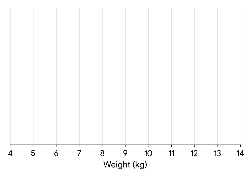
(ii) Complete the box and whisker diagram below, including the outlier.
Recall that the upper quartile () represents the point below which 75% of the data lies. Therefore, 25% of the data lies above . Use the total number of pumpkins to find the count.
The interquartile range (IQR) is the difference between the upper quartile () and the lower quartile ().
First, calculate the interquartile range (IQR). Then, use the given formula to find the lower and upper fences. Compare the minimum, maximum, and the outlier value with these fences.
Draw the box from to , with a line at the median. The whiskers extend to the minimum and maximum non-outlier values. Mark the outlier separately beyond the whisker.
Question 19
MediumPaper 1 · calculator6 marks(a) State whether the data is discrete or continuous.
A quality control manager inspects items from a production line and records the number of defects found on each item. The data is presented in the following table:
| Number of defects () | Number of items () |
|---|---|
| 0 | 15 |
| 1 | 25 |
| 2 | 35 |
| 3 | |
| 4 | 10 |
| 5 | 5 |
(b) The mean number of defects per item is . Find the value of .
(c) The quality control manager divided the day's production into two shifts: morning and afternoon. She then randomly selected items from the morning shift's output and items from the afternoon shift's output for inspection. Identify the sampling technique used.
Consider the nature of the variable 'number of defects'. Can it take any value within a range, or only specific, distinct values?
Recall the formula for the mean of a frequency distribution: . Set up an equation using the given mean and solve for .
Consider how the population was divided into subgroups and how samples were taken from each subgroup.
Question 20
MediumPaper 2 · calculator16 marksThe scores of eight students in a national mathematics competition and the number of hours they spent studying are shown in the following table.
| Student | Score (y) |
|---|---|
| A | 92 |
| B | 88 |
| C | 85 |
| D | 80 |
| E | 75 |
| F | 72 |
| G | 68 |
| H | 65 |
(a)(i) For this data, find the upper quartile.
(a)(ii) For this data, find the interquartile range.
(b) Determine if Student A's score is an outlier for this data. Justify your answer.
A researcher is investigating the relationship between students' mathematics competition scores and their study hours to determine whether study hours can reasonably be used to predict a student's score.
The study hours of the students are shown in the table.
| Student | Study Hours (x) | Score (y) |
|---|---|---|
| A | 40 | 92 |
| B | 35 | 88 |
| C | 20 | 85 |
| D | 30 | 80 |
| E | 15 | 75 |
| F | 25 | 72 |
| G | 10 | 68 |
| H | 10 | 65 |
The researcher finds that, for this data, the Pearson's product moment correlation coefficient is .
(c) State whether it would be appropriate for the researcher to use the equation of a regression line for on to predict a student's score. Justify your answer.
The researcher then decides to find the Spearman's rank correlation coefficient for this data, and creates a table of ranks (lowest value = rank 1).
| Student | Score Rank | Study Hours Rank |
|---|---|---|
| A | 8 | 8 |
| B | 7 | 7 |
| C | 6 | a |
| D | 5 | 6 |
| E | 4 | 3 |
| F | 3 | b |
| G | 2 | 1.5 |
| H | 1 | c |
(d)(i) Write down the value of:
a,
(d)(ii) Write down the value of:
b,
(d)(iii) Write down the value of:
c.
(e)(i) Find the value of the Spearman's rank correlation coefficient .
(e)(ii) Interpret the value obtained for .
(f) When calculating the ranks, the researcher incorrectly read Student A's score as 90. Explain why the value of the Spearman's rank correlation does not change despite this error.
First, ensure the scores are ordered from lowest to highest. Then, identify the position of the upper quartile () for an even number of data points.
You will need to find the lower quartile () first. Remember that the interquartile range is the difference between the upper and lower quartiles.
An outlier is typically defined as a data point that falls below or above . Use the values of , , and you found in part (a).
Consider what a Pearson's correlation coefficient of indicates about the strength of the linear relationship between the variables.
Rank the 'Study Hours' data from lowest to highest. If there are ties, assign the average of the ranks they would have occupied.
Rank the 'Study Hours' data from lowest to highest. If there are ties, assign the average of the ranks they would have occupied.
Rank the 'Study Hours' data from lowest to highest. If there are ties, assign the average of the ranks they would have occupied.
Use the formula , where is the difference in ranks and is the number of data pairs. You may also use your GDC.
Consider the range of possible values for (from -1 to 1) and what positive or negative values close to 1 or -1, or close to 0, signify.
Think about how ranks are assigned. If a value changes but still maintains its relative position (e.g., still the highest or lowest), how does that affect its rank?
No question on this page matches those filters. Try another difficulty or paper.
3 more Stats basics (population, 5 sampling techniques, outlier definition) questions in the app
Every answer is marked mark by mark, IB-style, and the AI tutor helps when you are stuck.
Where marks are lost
- Rounding an intermediate value and then using it in a later part. Costs a mark every time, and AI's multi-part modelling questions give it more chances to happen than AA's shorter, more self-contained ones.
- Using your own wrong value after failing a "show that." All follow through is withdrawn for the rest of that question.
- Leaving an answer in calculator notation. Never accepted in a final answer, and AI's constant calculator use makes this the easiest slip in the whole subject.