Presentation of data (frequency distribution tables, histograms, box & whisker, cumulative frequency graphs + using to find median quartiles, percentiles, range, IQR): notes and practice questions
- Univariate Data: Data in a single variable.
- Mode: The most common value.
- Median (): The middle value when data is ordered.
- Mean ( or ): The sum of all data divided by the total number of data points.
- Range: .
- Quartiles (): Divide data into four equal sections.
- Interquartile Range (IQR): .
- Outliers: Extreme values, marked with a cross () in box plots.
- Mean for a frequency table: where is frequency, is data value/mid-interval value, and .
- Mid-interval value (for grouped data): .
- Variance (): (GDC use expected).
- Ungrouped Data: Mode is specific value; use cumulative frequencies for median; exact range and IQR.
- Grouped Data: Data in class intervals; no exact range; modal class is interval with highest frequency; use mid-interval values () for mean/variance estimation.
- Histograms: Visual for continuous grouped data; no gaps between bars; x-axis is continuous variable, y-axis is frequency; bars from lower to upper boundary; shows modal class and distribution shape.
- Box Plots: Box from to with median line inside; whiskers extend to min/max non-outlier values; outliers marked with cross ().
- Cumulative Frequency Graphs: Plots running total of frequencies; use upper boundary of class interval for plotting; estimates median, quartiles, and percentiles for grouped data.
- GDC Use: Calculates statistical measures (mean, quartiles, standard deviation); input mid-interval values and frequencies for grouped data; GDC box plot function can show outliers.
- Grouped Data Estimates: Indicate values are estimates (e.g., round to 3 significant figures).
- Comparing Data Sets (Central Tendency): Use Median (with outliers) or Mean (symmetrical data).
- Comparing Data Sets (Dispersion): Use IQR (with outliers) or Standard Deviation (symmetrical data).
- Histograms vs. Bar Charts: Histograms have no gaps (continuous data); Bar charts have gaps (qualitative/discrete data).
- SL/HL Distinction: Foundational concepts and GDC use for statistics are identical for both levels.
How it is examined
Reading values off a cumulative frequency graph is a standard two or three mark sequence, and the graph is supplied. Producing a box and whisker diagram is a drawing task, so it needs canvas support, and the cross for an outlier is a marking point in its own right. Comparing two distributions asks for a sentence that names the statistic and the direction, not just "A is bigger".
- The presentation of discrete and continuous data as frequency distribution tables.
- Histograms.
- Cumulative frequency and cumulative frequency graphs, using them to find the median, quartiles, percentiles, range and interquartile range.
- The production and understanding of box and whisker diagrams.
Not required: frequency density histograms. So a question with unequal class widths is out of syllabus.
Linking questions
- Links to other subjects: presentation of data (sciences, individuals and societies).
- International-mindedness: discussion of the different formulae for the same statistical measure, for example variance.
- TOK: what is the difference between information and data? Does "data" mean the same thing in different areas of knowledge?
Practice questions
29 questions · 24 medium · 5 hardQuestion 1
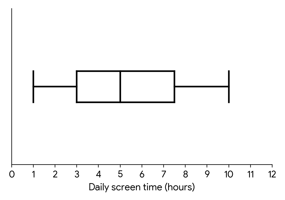
MediumPaper 1 · calculator5 marksThe daily screen time (in hours) for a group of students was recorded. The data was organized in a box and whisker diagram as shown below:
For this data, write down
(i) the minimum daily screen time.
For this data, write down
(ii) the lower quartile.
For this data, write down
(iii) the median daily screen time.
A student, Sarah, claims that this box and whisker diagram indicates that the percentage of students who spend less than 3 hours on screen time is smaller than the percentage of students who spend more than 7.5 hours on screen time.
State whether Sarah is correct. Justify your answer.
Identify the leftmost point of the whisker on the box and whisker diagram. This point represents the minimum value in the dataset.
Locate the left edge of the box in the box and whisker diagram. This line represents the lower quartile (Q1).
Find the line inside the box. This line indicates the median (Q2) of the data.
Recall what each section of a box and whisker diagram represents in terms of the proportion of data. Consider the percentage of data points that fall within each quartile range.
Question 2
HardPaper 2 · calculator22 marksA logistics company recorded the delivery times (in minutes) for a large batch of packages. The data is grouped in the frequency table below:
Delivery Time (minutes) | Frequency
---|---
|
|
|
|
|
|
|
|
|
|
(a) Calculate estimates of the mean and standard deviation of the delivery times.
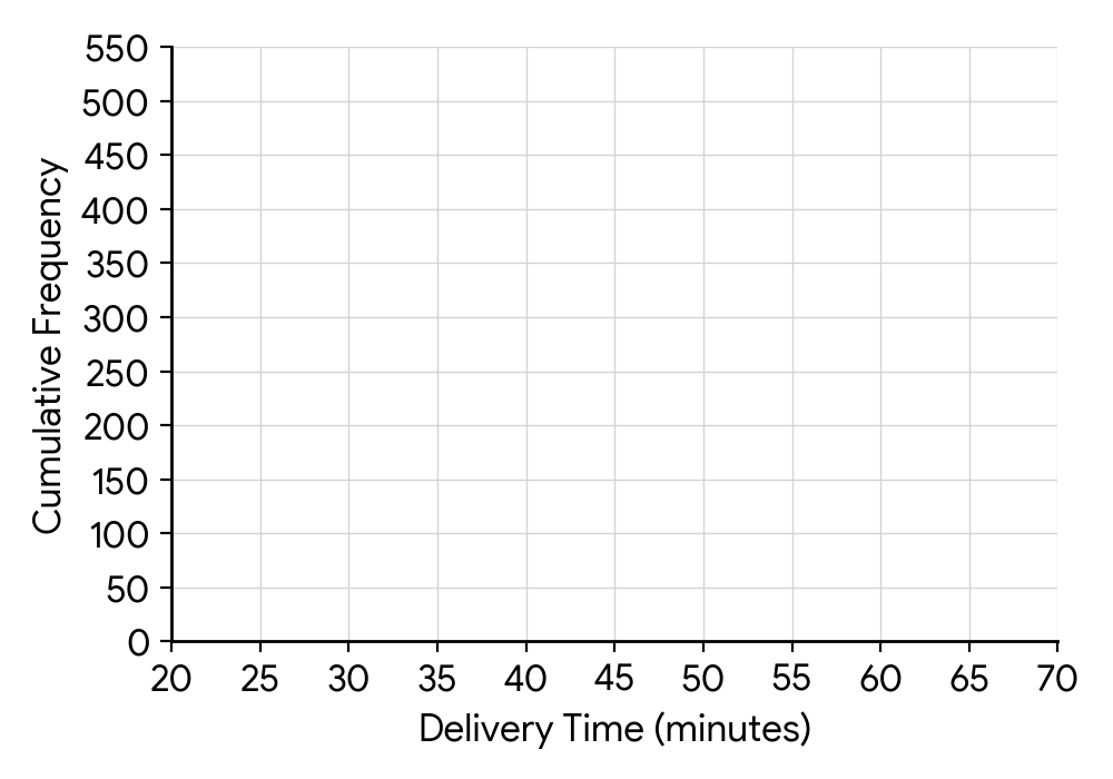
(b) Construct a cumulative frequency table for the data, and use it to draw a cumulative frequency curve.
(c) Use your graph to estimate:
(i) the median delivery time
(ii) the lower and upper quartile of the delivery times
(iii) the interquartile range
(iv) the th percentile of delivery times.
(d) Draw a box-and-whisker plot of the data.
(e) Determine, with reasons, whether any customers could be considered outliers.
For grouped data, first find the midpoint of each class interval. Use these midpoints as the 'x' values for calculating the mean and standard deviation.
To construct the cumulative frequency table, add up the frequencies sequentially. When drawing the curve, plot the upper class boundary against the cumulative frequency.
The median corresponds to the 50th percentile. On the cumulative frequency curve, find the value on the x-axis that corresponds to 50% of the total frequency on the y-axis.
The lower quartile (Q1) is at 25% of the total frequency, and the upper quartile (Q3) is at 75% of the total frequency.
The interquartile range (IQR) is the difference between the upper quartile (Q3) and the lower quartile (Q1).
The 85th percentile corresponds to 85% of the total frequency.
Remember to include the minimum value, Q1, median, Q3, and maximum value. The whiskers extend to the minimum and maximum values that are not outliers.
Use the outlier rule: A data point is an outlier if it is less than or greater than . Consider the range of values within the extreme class intervals.
Question 3
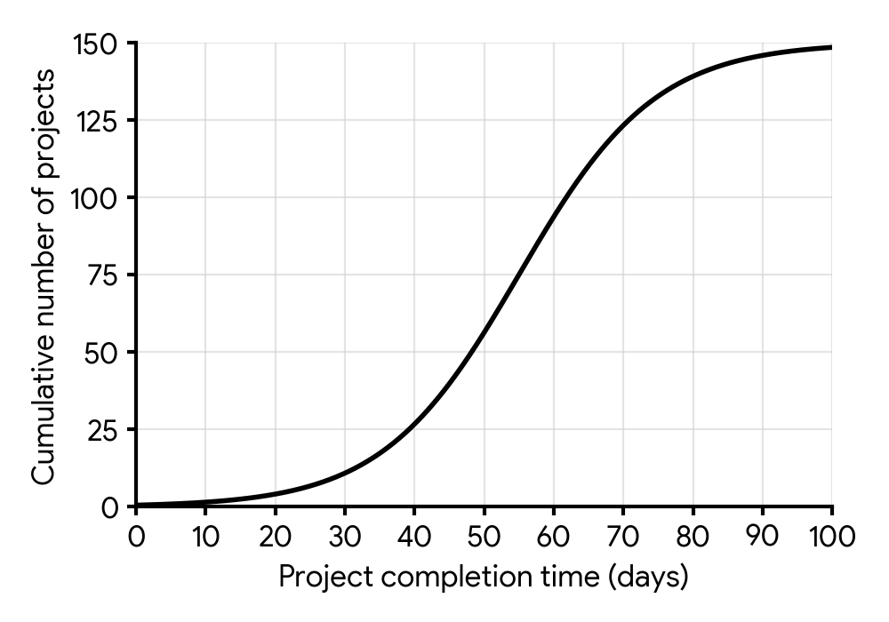
MediumPaper 1 · calculator9 marksA software development company tracked the completion times of 150 projects. The cumulative frequency graph shows the completion times obtained by the projects.
Find the median completion time of the projects.
The projects were assigned a performance tier from 1 to 5, depending on the completion time. The number of projects receiving each tier is shown in the following table.
| Tier | 1 | 2 | 3 | 4 | 5 |
|---|---|---|---|---|---|
| Number of projects | 8 | 15 | 30 | p | q |
Find an expression for in terms of .
The mean performance tier for these projects is 3.5.
Find the number of projects that obtained a tier 5.
Find the minimum completion time needed to obtain a tier 5.
The median is the value at the 50th percentile. For a cumulative frequency graph, this means finding the value on the x-axis that corresponds to half of the total frequency on the y-axis.
The total number of projects is 150. The sum of the number of projects in all tiers must equal the total number of projects.
Use the formula for the mean of a frequency distribution: . Substitute the expression for from part (b) into this formula and solve for .
If there are projects in Tier 5, then these are the projects with the longest completion times. To find the minimum time for Tier 5, you need to find the completion time corresponding to the th project on the cumulative frequency graph.
Question 4
HardPaper 2 · calculator12 marksA survey was conducted to investigate the daily screen time (in minutes) of 80 students. The results are presented in the frequency table below.
Time ( minutes) | Frequency
---|---
|
|
|
|
|
|
|
(a) State the modal class.
(b) Find the class in which the median time lies.
(c) Construct a cumulative frequency table for this data.
(d) Sketch the cumulative frequency curve.
(e) Use your curve to find estimates for the median and interquartile range.
The modal class is the class interval with the highest frequency.
First, find the total number of students. The median position is half of the total number of students. Then, identify which class interval contains this position by summing frequencies.
For a cumulative frequency table, list the upper class boundaries and their corresponding cumulative frequencies. The cumulative frequency for a given class is the sum of its frequency and the frequencies of all preceding classes.
Plot the upper class boundaries against the cumulative frequencies. Remember to start the curve at the lower boundary of the first class with a cumulative frequency of 0.
To find the median, locate the cumulative frequency corresponding to half the total number of students. For the interquartile range, find the cumulative frequencies for the lower (25%) and upper (75%) quartiles. Then, read the corresponding time values from the x-axis.
Question 5
MediumPaper 1 · calculator5 marksA factory conducts quality control checks on the diameter (in mm) of components produced by Production Line A. A sample of measurements is recorded as:
18.2, 19.5, 20.1, 20.3, 20.5, 20.6, 20.8, 21.0, 21.2, 21.5, 22.0, 22.1, 22.3, 22.5, 23.0
For these data, the lower quartile is 20.3 mm and the upper quartile is 22.1 mm.
Show that a component with a diameter of 18.2 mm would not be considered an outlier.
Another production line, Line B, also produces similar components. The box and whisker diagram below displays the diameters (in mm) of a sample of components from Line B.
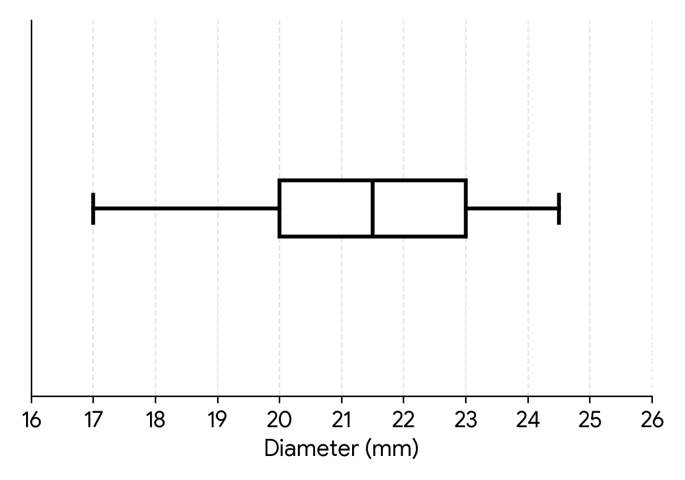
A quality control manager reviews the box and whisker diagrams for both lines and suggests that Production Line B generally produces components with larger diameters.
With reference to the box and whisker diagrams for Line A (from part (a) ) and Line B, state one aspect that may support the manager's opinion and one aspect that may counter it.
Recall the formula for identifying outliers using the interquartile range (IQR). An outlier is typically defined as a value that falls below or above .
Compare the key features of the box and whisker diagrams for Line A and Line B. Consider measures of central tendency (like median) and measures of spread (like IQR or range) to support or counter the manager's claim.
Question 6
HardPaper 2 · calculator21 marksDr. Anya Sharma, a sports scientist, is investigating the relationship between training habits and performance in junior athletes. She wants to collect data on the weekly training hours of junior swimmers. She decides to interview every 5th swimmer entering the training facility until she has a sample of 50 swimmers.
State the sampling method Dr. Sharma has used.
Dr. Sharma constructed the following box and whisker diagram to show the weekly training hours (in hours) of a sample of junior swimmers.
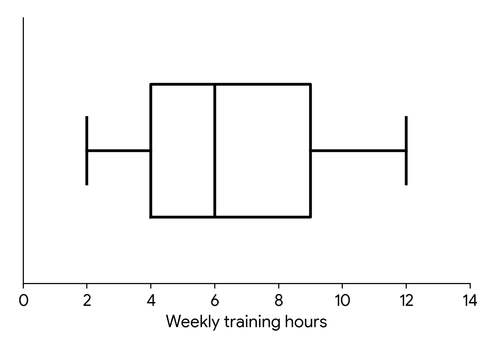
Write down the median weekly training hours.
Calculate the interquartile range for the weekly training hours.
One swimmer in the sample reported training for 15 hours per week. Dr. Sharma believes this swimmer's training time is not an outlier.
Determine whether Dr. Sharma is correct. Support your reasoning.
Dr. Sharma also collected data on the average weekly training hours () and the competition score () for a group of athletes. These data are represented on the scatter diagram.
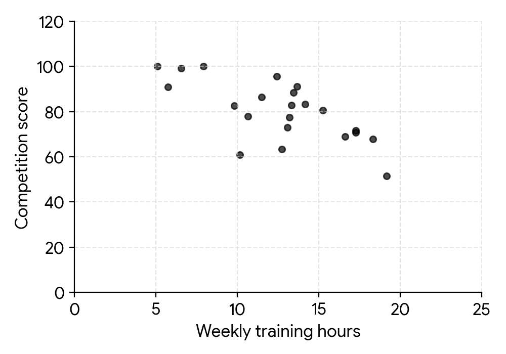
Describe the correlation between weekly training hours and competition score.
Dr. Sharma correctly calculates the equation of the regression line on for these athletes to be . She uses the equation to estimate the competition score for an athlete who trains 3 hours per week.
Find the competition score calculated by Dr. Sharma.
State whether it is valid to use the regression line on for Dr. Sharma's estimate in part (f). Give a reason for your answer, assuming the original data for training hours ranged from 5 to 20 hours.
Dr. Sharma investigated the relationship between an athlete's national competition rank and their average daily protein intake (in grams). She collected data for eight athletes, as shown in the table.
| Athlete | A | B | C | D | E | F | G | H |
|---|---|---|---|---|---|---|---|---|
| Competition Rank () | 1 | 2 | 3 | 4 | 5 | 6 | 7 | 8 |
| Protein Intake (g) () | 180 | 150 | 200 | 160 | 140 | 190 | 170 | 130 |
Dr. Sharma intends to analyse the data using Spearman's rank correlation coefficient, .
Copy and complete the information in the following table.
| Athlete | A | B | C | D | E | F | G | H |
|---|---|---|---|---|---|---|---|---|
| Rank - Competition Rank | 1 | |||||||
| Rank - Protein Intake |
Calculate the value of .
Interpret your result.
Consider how the sample is selected. Is there a systematic rule applied, or is it based on categories and targets?
The median is represented by the line inside the box of a box and whisker diagram.
The interquartile range (IQR) is the difference between the third quartile (Q3) and the first quartile (Q1).
An outlier is typically defined as a data point that falls more than 1.5 times the interquartile range (IQR) below the first quartile (Q1) or above the third quartile (Q3). Calculate the upper and lower fences.
Observe the general trend of the points on the scatter diagram. Do they tend to go up or down from left to right?
Substitute the given value of into the regression equation to find the corresponding value.
Consider if the value used for prediction falls within the range of the original data used to create the regression line.
Assign ranks to the 'Protein Intake' values. If 'Competition Rank' is already ranked from 1 to 8 (best to worst), then for 'Protein Intake', assign rank 1 to the highest intake, rank 2 to the next highest, and so on.
Use the formula for Spearman's rank correlation coefficient: , where is the difference between the ranks and is the number of data pairs.
Consider the sign and magnitude of . What does a positive or negative value mean, and what does a value close to 0 or 1 (or -1) indicate about the strength of the relationship?
Question 7
MediumPaper 1 · calculator8 marksA group of 160 participants completed a fitness challenge. The cumulative frequency graph shows the points obtained by the participants.
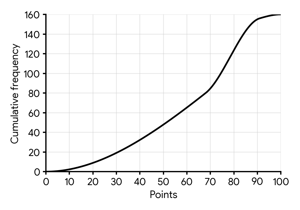
Find the median of the points obtained.
The participants were awarded a performance grade from 1 to 5, depending on the points obtained in the challenge.
The number of participants receiving each grade is shown in the following table.
| Grade | 1 | 2 | 3 | 4 | 5 |
|---|
| Number of participants | 8 | 15 | 30 | a | b |
|---|
Find an expression for in terms of .
The mean grade for these participants is 3.5.
Find the number of participants who obtained a grade 5.
Find the minimum points needed to obtain a grade 5.
The median corresponds to the value at the 50th percentile of the data. For 160 participants, this means finding the score for the 80th participant on the cumulative frequency graph.
The sum of all participants across all grades must equal the total number of participants in the fitness challenge.
The mean grade is calculated by summing the product of each grade and its frequency, then dividing by the total number of participants. Use the expression for 'a' from part (b).
Grade 5 represents the highest performance level. If 'b' participants obtained grade 5, these are the top 'b' participants. Use the cumulative frequency graph to find the score that separates the top 'b' participants from the rest.
Question 8
HardPaper 2 · calculator21 marksThe lifespans, , of 250 LED light bulbs are recorded in the following table.
| Lifespan (hours) | Frequency |
|---|---|
| 20 | |
| 60 | |
| 90 | |
| 55 | |
| 25 |
This table is used to create a cumulative frequency graph.
Write down the mid-interval value of the class .
Calculate an estimate of the mean lifespan of the 250 light bulbs.
Use the cumulative frequency curve (which would be provided in an exam) to estimate the interquartile range. Assume the lower quartile () is hours and the upper quartile () is hours.
A light bulb from the data set had a lifespan of hours.
Use your answer to part (b) to estimate whether this light bulb's lifespan is an outlier for this data. Justify your answer.
It is believed that the lifespans of these LED light bulbs follow a normal distribution with mean hours and standard deviation hours.
It is decided to perform a goodness of fit test on the data to determine whether this sample of 250 light bulbs could have plausibly been drawn from an underlying distribution .
Write down the null and the alternative hypotheses for the test.
As part of the test, the following table is created.
| Lifespan of light bulb (hours) | Observed frequency | Expected frequency |
|---|---|---|
| 20 | 14.0 | |
| 60 | 60.1 | |
| 90 | a | |
| 55 | 60.1 | |
| 25 | b |
Find the value of and the value of . Give your answers to one decimal place.
Hence, perform the test to a 5% significance level, clearly stating the conclusion in context.
The mid-interval value is the average of the lower and upper bounds of the class interval.
To estimate the mean from grouped data, multiply each mid-interval value by its corresponding frequency, sum these products, and then divide by the total frequency.
The interquartile range (IQR) is the difference between the upper quartile () and the lower quartile ().
An outlier is typically defined as a value that is more than below or above . Calculate the upper bound for outliers.
The null hypothesis () usually states that there is no difference or that the data fits the proposed model. The alternative hypothesis () states that there is a difference or the data does not fit the model.
For a normal distribution , the probability can be found using the cumulative distribution function (CDF), . Then, multiply this probability by the total number of observations to get the expected frequency.
Calculate the Chi-squared test statistic using the formula . Then find the p-value using the degrees of freedom (). Compare the p-value to the significance level to draw a conclusion.
Question 9
MediumPaper 1 · calculator19 marks[Maximum mark: 19]
A tech company recorded the time (in minutes) 180 customers spent completing a new online feedback survey. The data was compiled into the following cumulative frequency graph.
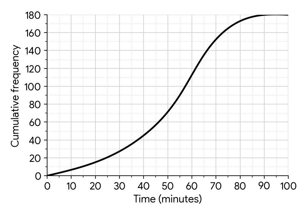
(a) Use the graph to find
(i) the median time;
(ii) the lower quartile;
(iii) the upper quartile;
(iv) the interquartile range.
Sarah completed the survey in 1.5 minutes.
(b) Determine whether Sarah's time is an outlier.
Remember to locate the correct cumulative frequency value for the median (50th percentile) before reading from the graph.
The lower quartile represents the 25th percentile of the data.
The upper quartile represents the 75th percentile of the data.
The interquartile range (IQR) is the difference between the upper quartile (Q3) and the lower quartile (Q1).
Recall the formula for identifying outliers: a data point is an outlier if it is less than Q1 - 1.5 IQR or greater than Q3 + 1.5 IQR.
Question 10
HardPaper 2 · calculator21 marks(a) The scores, , of 200 students on a mathematics test are recorded in the following table.
| Score () | Frequency |
|---|---|
| 15 | |
| 35 | |
| 60 | |
| 50 | |
| 30 | |
| 10 |
(i) Write down the mid-interval value of .
(ii) Calculate an estimate of the mean score of the 200 students.
(b) The data from this table is used to create a cumulative frequency graph. From this graph, the first quartile () is estimated to be and the third quartile () is estimated to be .
Use these values to estimate the interquartile range (IQR).
(c) A student, Elara, scored on the test.
Use your answer to part (b) to estimate whether Elara's score is an outlier for this data. Justify your answer.
(d) It is believed that the scores of students on this mathematics test follow a normal distribution with mean and standard deviation .
It is decided to perform a goodness of fit test on the data to determine whether this sample of 200 students could have plausibly been drawn from an underlying distribution .
Write down the null and the alternative hypotheses for the test.
(e) As part of the test, the following table is created, where some categories have been combined to ensure expected frequencies are not too low.
| Score () | Observed Frequency | Expected Frequency |
|---|---|---|
| 15 | 6.08 | |
| 35 | 32.08 | |
| 60 | a | |
| 50 | 63.99 | |
| 40 | b |
(i) Find the value of and the value of .
(ii) Hence, perform the test to a 5% significance level, clearly stating the conclusion in context.
The mid-interval value is the average of the lower and upper bounds of the interval.
To estimate the mean from grouped data, multiply each mid-interval value by its frequency, sum these products, and then divide by the total number of students.
The interquartile range (IQR) is the difference between the third quartile () and the first quartile ().
An outlier is typically defined as a value that is more than below or above . Calculate the upper and lower bounds for outliers.
The null hypothesis () states that there is no significant difference, while the alternative hypothesis () states that there is a significant difference. Make sure to reference the specific distribution parameters.
(i) Use the normal distribution to calculate the probabilities for the given intervals and multiply by the total number of students (200) to find the expected frequencies.
(ii) Calculate the statistic and the p-value. The degrees of freedom for a goodness-of-fit test when parameters are given is (number of categories - 1). Compare the p-value to the significance level to draw a conclusion.
Question 11
MediumPaper 1 · calculator4 marks[Maximum mark: 4]
A salesperson records the number of items sold per day over several weeks. The data is presented in the following frequency distribution table.
| Number of items sold () | Frequency () |
|---|---|
| 1 | 3 |
| 2 | 5 |
| 3 | 8 |
| 4 | p |
| 5 | 6 |
| 6 | 4 |
| Frequency (f)
------------------------|---------------
1 | 3
2 | 5
3 | 8
4 | p
5 | 6
6 | 4
)
For this distribution, the mean number of items sold per day is 3.8.
(a) Write down the total number of days the salesperson recorded data in terms of p.
(b) Calculate the value of p.
To find the total number of days, sum all the frequencies in the table.
The formula for the mean of a frequency distribution is . Use the given mean and your expression for the total number of days from part (a).
Question 12
MediumPaper 1 · calculator7 marksA tech company launched two new smartphone models, "Voyager" and "Explorer". They collected customer satisfaction scores (out of 100) from a large sample of users for both models. The results are summarized in the following box and whisker diagram.
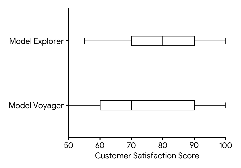
Identify which two of the following statements must be true according to the box and whisker diagram. Indicate your choices by placing tick marks in the second column of the following table.
Statement | True (✓)
---|---
The satisfaction scores for Model Voyager are normally distributed. |
A higher percentage of customers gave a score less than 70 for Model Voyager than for Model Explorer. |
A higher percentage of customers gave a score greater than 90 for Model Explorer than for Model Voyager. |
The interquartile range for Model Explorer is less than the interquartile range for Model Voyager. |
A product manager believes there is no significant difference in the average customer satisfaction scores between the two models. She plans to conduct a t-test at the 10% significance level. Write down the null and alternative hypotheses for her test.
The t-test yielded a p-value of 0.0783. Find the p-value for her test.
Write down the conclusion to the test. Give a reason for your answer.
Recall how percentages of data are distributed within the quartiles of a box and whisker diagram. For example, 25% of data lies below the first quartile (Q1), and 50% lies below the median. The interquartile range (IQR) is the difference between the third quartile (Q3) and the first quartile (Q1).
Remember that the null hypothesis (H₀) typically states no effect or no difference, while the alternative hypothesis (H₁) states what is being tested for (a difference). Use appropriate notation for population means.
The p-value is directly provided in the question stem.
Compare the p-value from part (c) with the significance level stated in part (b) to determine whether to reject the null hypothesis.
Question 13
MediumPaper 2 · calculator15 marksA fitness enthusiast, Alex, recorded the number of steps (in hundreds) he took each day over a period of days. The data is given below in ascending order:
(a) Find the median number of steps.
(b) Find the lower quartile (Q1).
(c) Find the upper quartile (Q3).
(d) Find the range of the data.
(e) Determine whether there are any outliers in the data.
(f) Draw a box-and-whisker diagram for the above data, marking any outliers as required.
The median is the middle value of an ordered dataset. For an even number of data points, it's the average of the two middle values.
The lower quartile (Q1) is the median of the lower half of the data. For an even number of data points in the lower half, average the two middle values.
The upper quartile (Q3) is the median of the upper half of the data. For an even number of data points in the upper half, average the two middle values.
The range is the difference between the maximum and minimum values in the dataset.
An outlier is a data point that falls outside the interval . First, calculate the Interquartile Range (IQR).
A box-and-whisker diagram requires five key values: minimum non-outlier, Q1, median, Q3, and maximum non-outlier. Outliers are marked separately.
Question 14
MediumPaper 2 · calculator12 marksP2: A farmer, Mr. Jensen, is analyzing the harvest from a new variety of apple trees. He recorded the weights (in grams) of 25 randomly selected apples.
, , , , , , , , , , , , , , , , , , , , , , , ,
Copy and complete the following grouped frequency table.
Weight, ( g) | Frequency
---|---
|
|
|
|
|
Find an estimate for the mean weight, using the frequency table. Give your answer to one decimal place.
Find an estimate for the variance, using the frequency table. Give your answer to three significant figures.
Find an estimate for the standard deviation, using the frequency table. Give your answer to three significant figures.
Mr. Jensen also harvested apples from an older variety of trees. For these apples, the mean weight was g and the standard deviation was g. Compare the weights of the apples from the new variety and the older variety, drawing specific conclusions.
Carefully go through each data point and assign it to the correct weight interval. Remember that the upper bound of each interval is exclusive.
To estimate the mean from a grouped frequency table, use the midpoint of each class interval. Multiply each midpoint by its frequency, sum these products, and then divide by the total frequency.
The estimated variance from grouped data is calculated as the sum of divided by the total frequency, where is the midpoint and is the estimated mean.
The standard deviation is the square root of the variance.
Compare the mean values to understand the average weight difference. Compare the standard deviation values to understand the spread or consistency of the weights. Then, synthesize these comparisons into a clear conclusion.
Question 15
MediumPaper 1 · calculator12 marks(a) State whether the following set of data is discrete or continuous, and, in each case, construct a frequency table.
The number of cars passing a specific checkpoint in 10-minute intervals during rush hour:
(b) State whether the following set of data is discrete or continuous, and, in each case, construct a frequency table using appropriate class intervals.
The heights of saplings (in cm) in a plant nursery:
(c) State whether the following set of data is discrete or continuous, and, in each case, construct a frequency table.
The number of correct answers on a 10-question multiple-choice quiz for a group of students:
Consider if the data can take any value within a range or only specific, separate values. For the frequency table, count how many times each unique value appears.
Heights can take any value within a range, suggesting continuous data. For the frequency table, you'll need to group the data into intervals, for example, of 3 cm.
Think about whether you can have a fractional number of correct answers. Then, count the occurrences of each score.
Question 16
MediumPaper 1 · calculator7 marksThe following table shows the student enrollment figures for various faculties at a major university.
| Faculty | Enrollment (thousands of students) |
|---|---|
| Arts | |
| Science | |
| Engineering | |
| Business | |
| Medicine |
(a) Calculate the total number of students enrolled at the university.
(b) Determine the percentage of students enrolled in the Faculty of Engineering, giving your answer to one decimal place.
To find the total number of students, sum the enrollments from all faculties listed in the table. Remember to include the units in your final answer.
First, identify the enrollment for the Faculty of Engineering and the total university enrollment (from part (a) ). Then, divide the engineering enrollment by the total and multiply by 100 to get the percentage. Remember to round to one decimal place.
Question 17
MediumPaper 2 · calculator12 marksA city's energy department records the total annual electricity consumption (in GWh) for the years to . The results are shown in the table.
Year | | | | |
---|---|---|---|---|---
Consumption [GWh] | | | | |
(a) Calculate the mean annual electricity consumption for these five years.
(b) Calculate the standard deviation of the annual electricity consumption over these five years.
(c) Calculate the percentage increase in annual electricity consumption from to .
(d) The city council publishes an infographic to highlight the trend in electricity consumption using a bar chart where the vertical axis starts at GWh.
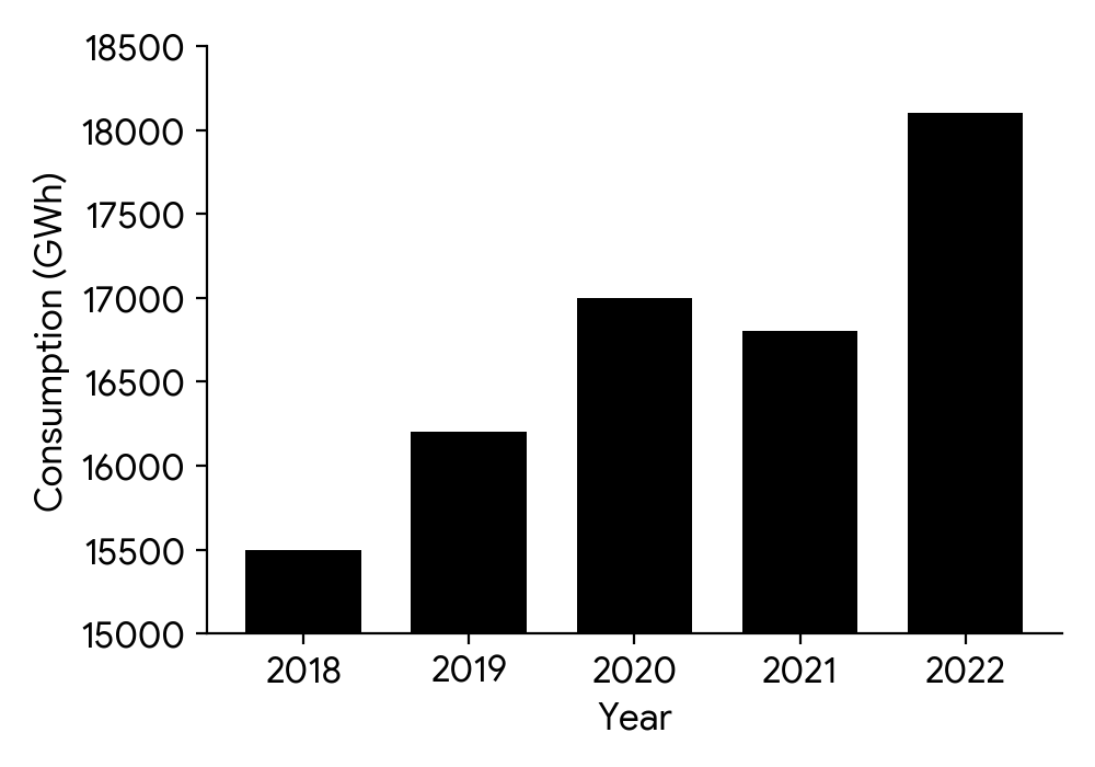
(i) Explain why this diagram may give a misleading picture.
(ii) State reasons why the bar chart might be drawn in this way.
To find the mean, sum all the consumption values and divide by the number of years.
Use your GDC's statistics function to find the standard deviation. Ensure you select the correct standard deviation (sample or population) if prompted, though for this type of question, sample standard deviation is usually expected for a dataset of this size.
The formula for percentage increase is .
Consider the effect of a truncated vertical axis on the visual representation of data changes.
Think about the motivations a city council might have when presenting data to the public.
Question 18
MediumPaper 2 · calculator12 marksThe grouped frequency table shows the daily commute times (in minutes) for the employees at a technology company.
Commute time, (minutes) | Frequency
---|---
|
|
|
|
|
|
|
Construct a cumulative frequency table for this data.
Plot the points and draw the cumulative frequency curve for the data.
Use your curve or calculations to find an approximate value for:
(i) the median commute time;
(ii) the interquartile range.
The lowest commute time recorded was minutes and the greatest was minutes.
Draw a box-and-whisker plot to represent the data.
Remember that cumulative frequency is the running total of frequencies. The last value in the cumulative frequency column should be the total number of employees.
Plot the upper class boundaries against the cumulative frequencies. Ensure your axes are correctly labelled and scaled.
For the median, find the position . For the interquartile range, find the positions and . Use linear interpolation if calculating, or read from your graph if using the curve.
You will need the minimum value, Q1, median, Q3, and maximum value. Ensure your plot is drawn to scale.
Question 19
MediumPaper 2 · calculator7 marksA small online retail company, 'GadgetHub', tracks its daily advertising expenditure and the corresponding number of units sold for a new product over a period of ten days.
| Daily Advertising Spend (USD), | Units Sold, |
|---|---|
Draw a scatter graph to represent this information. Label the axes clearly.
Describe the correlation between daily advertising spend and units sold.
State whether you think the daily advertising spend has an effect on the number of units sold. Give a reason for your answer.
Remember to label your axes with the correct variables and units. Plot each data point accurately according to its coordinates.
Consider the direction (positive/negative), strength (strong/moderate/weak), and form (linear/non-linear) of the relationship shown in your scatter graph.
Based on the correlation you described in part (b), what can you infer about the relationship between the two variables? Does an increase in one variable seem to be associated with an increase or decrease in the other?
Question 20
MediumPaper 1 · calculator8 marksP1: The box-and-whisker diagram below illustrates the daily screen time (in hours) for a sample of teenagers.
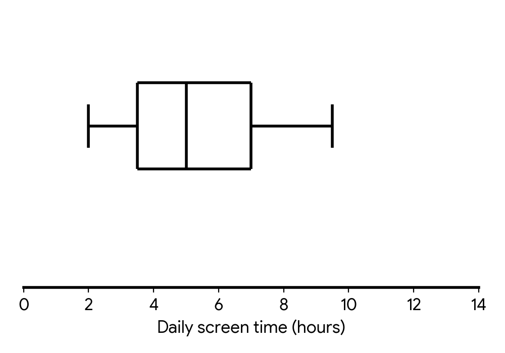
(a) Find the range of daily screen times.
(b) Find the interquartile range (IQR) of daily screen times.
(c) Find the percentage of teenagers who spend between and hours on screen time daily.
(d) A new survey participant reported spending hours on screen time daily.
Determine whether this time would be counted as an outlier.
The range is the difference between the maximum and minimum values in the data set.
The interquartile range (IQR) is the difference between the upper quartile (Q3) and the lower quartile (Q1).
Recall what each section of a box-and-whisker diagram represents in terms of percentage of data.
An outlier is typically defined as a data point that falls below Q1 - 1.5 IQR or above Q3 + 1.5 IQR.
No question on this page matches those filters. Try another difficulty or paper.
9 more Presentation of data (frequency distribution tables, histograms, box & whisker, cumulative frequency graphs + using to find median quartiles, percentiles, range, IQR) questions in the app
Every answer is marked mark by mark, IB-style, and the AI tutor helps when you are stuck.
Where marks are lost
- Using your own wrong value after failing a "show that." All follow through is withdrawn for the rest of that question.
- Leaving an answer in calculator notation. Never accepted in a final answer, and AI's constant calculator use makes this the easiest slip in the whole subject.