Linear Correlation of bivariate data (scatter diagrams, lines of best fit, Pearson) + regression line interpretation: notes and practice questions
- Bivariate Data: Data on two variables, paired to examine relationships.
- Correlation vs. Causation: Correlation does not imply causation.
- Linear Correlation Types (Scatter Diagram):
- Strong Positive: Tightly clustered, upward line.
- Weak Positive: Upward trend, loosely scattered.
- Strong Negative: Tightly clustered, downward line.
- Weak Negative: Downward trend, loosely scattered.
- No Correlation: Scattered, no linear pattern.
- **Pearson's Product-Moment Correlation Coefficient (PMCC), :* Measures strength and direction of linear* relationship.
- Range: .
- : Perfect positive linear correlation.
- : Perfect negative linear correlation.
- : No linear correlation.
- Closer to or indicates stronger linear correlation.
- Pearson's PMCC Formula:
Where:
- Regression Line Equation (y on x):
- **Gradient ():** Change in for each unit change in .
- Positive : increases by for unit increase.
- Negative : decreases by for unit increase.
- **Y-intercept ():** Value of when .
- Mean Point: always lies on the regression line.
- Drawing Line of Best Fit by Eye: Plot data, calculate and plot , draw line through mean point following trend.
- Spearman's Rank Correlation Coefficient: Calculate PMCC on ranked data (tied values get mean rank).
- GDC Use: Enter data into lists, use linear regression (`ax + b`) to find . Store full values for predictions to avoid rounding errors.
- HL Extension: Non-linear regression (quadratic, cubic, exponential , power , sinusoidal). Linearise exponential ( vs ) and power ( vs ) relationships using logarithms.
- Outliers: Bivariate outliers are distinct from univariate outliers.
- Rounding Errors: Use exact and values for intermediate prediction steps.
- Contextual Logic: Interpretations and predictions must be reasonable for the given situation.
How it is examined
One of the highest-frequency subtopics in the course. The pattern is: calculate , describe the correlation in words, find the regression equation, use it to predict, then comment on the reliability of that prediction. The last two marks are where students lose out, because "the prediction is unreliable" needs a reason, usually extrapolation beyond the data range or a weak . Interpreting and in context (a rate and a starting value) is a separate mark and students give generic answers. Predicting from using the on line is the specific error the guide calls out.
The formula for Pearson's and for the regression line of on .
- Linear correlation of bivariate data.
- Pearson's product-moment correlation coefficient, .
- Scatter diagrams, and lines of best fit by eye passing through the mean point.
- The equation of the regression line of on .
Linking questions
- Other contexts: linear regressions where correlation exists between two variables. Exploring cause and dependence for categorical variables, for example what factors political persuasion might depend on.
- Links to other subjects: curves of best fit, correlation and causation (sciences); scatter graphs (geography).
- Aim 8: the correlation between smoking and lung cancer was discovered using mathematics, and science then had to justify the cause.
- TOK: correlation and causation. Can we have knowledge of cause and effect relationships given that we can only observe correlation? What factors affect the reliability and validity of mathematical models in describing real-life phenomena?
Practice questions
36 questions · 2 easy · 27 medium · 7 hardQuestion 1
EasyPaper 1 · calculator5 marksA marine biologist is analysing data collected from various ocean environments. For each scenario described below, decide which of the following statements best represents the relationship between the two variables shown in the scatter diagram.
Statements:
I. Strong positive linear correlation
II. Weak positive linear correlation
III. No correlation
IV. Weak negative linear correlation
V. Strong negative linear correlation
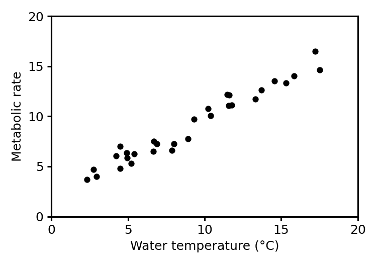
(a) The scatter diagram represents the relationship between water temperature and the metabolic rate of a certain fish species.
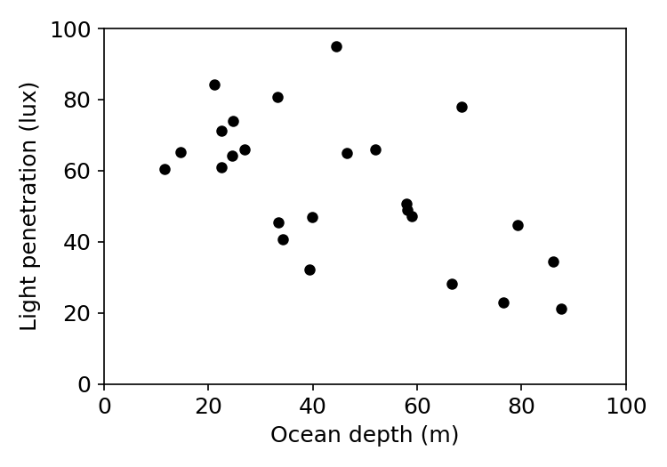
(b) The scatter diagram represents the relationship between ocean depth and the amount of light penetration.
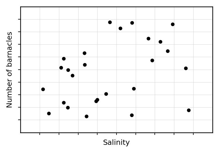
(c) The scatter diagram represents the relationship between the salinity of the water and the number of barnacles on a specific rock.
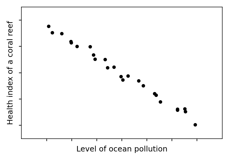
(d) The scatter diagram represents the relationship between the level of ocean pollution and the health index of a coral reef.
(e) The scatter diagram represents the relationship between the density of plankton and the population size of a specific small fish species.
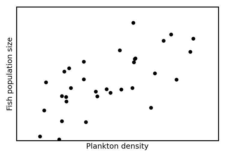
Consider the direction and tightness of the cluster of points. Upward slope indicates positive, downward indicates negative. Tight clustering indicates strong, spread out indicates weak.
Consider the direction and tightness of the cluster of points. Upward slope indicates positive, downward indicates negative. Tight clustering indicates strong, spread out indicates weak.
Consider the direction and tightness of the cluster of points. Upward slope indicates positive, downward indicates negative. Tight clustering indicates strong, spread out indicates weak.
Consider the direction and tightness of the cluster of points. Upward slope indicates positive, downward indicates negative. Tight clustering indicates strong, spread out indicates weak.
Consider the direction and tightness of the cluster of points. Upward slope indicates positive, downward indicates negative. Tight clustering indicates strong, spread out indicates weak.
Question 2
MediumPaper 1 · calculator6 marksClara, a small business owner, believes there is a linear relationship between the daily advertising spend and the weekly sales for her new product.
To investigate this, she recorded the daily advertising spend, x hundreds of dollars, and the weekly sales, y thousands of dollars, for eight consecutive weeks. Her results are presented in the following table and scatter diagram.
| x, hundreds of dollars | y, thousands of dollars |
|---|---|
| 5 | 11.7 |
| 8 | 12.6 |
| 10 | 15.0 |
| 12 | 17.5 |
| 15 | 16.6 |
| 18 | 18.4 |
| 20 | 22.4 |
| 22 | 22.4 |
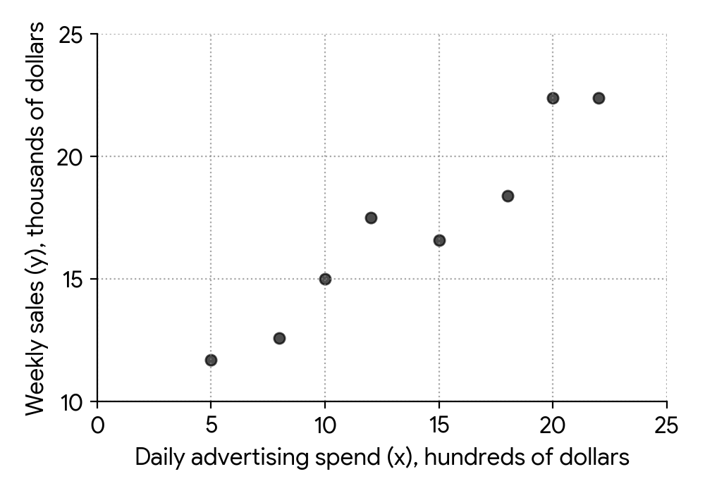
Clara consulted a business analytics textbook and found the following guidelines for interpreting the Pearson's product-moment correlation coefficient, r:
| Value of | Description of the correlation |
|---|---|
| weak | |
| moderate | |
| strong |
For this data, find the value of the Pearson's product-moment correlation coefficient, r.
Comment on your answer to part (a), using the information that Clara found.
Write down the equation of the regression line of y on x, in the form .
Clara is considering a daily advertising spend of 17 hundreds of dollars for the next week.
Use the equation of the regression line to estimate the weekly sales for this advertising spend.
Use your GDC to calculate the Pearson's product-moment correlation coefficient. Input the x-values into List 1 and the y-values into List 2, then use the two-variable statistics or linear regression function.
Refer to the table provided in the question to describe the strength of the correlation based on your calculated 'r' value. Also consider the sign of 'r'.
Using your GDC, find the linear regression equation. Ensure you identify the correct 'a' (slope) and 'b' (y-intercept) values. Remember to use 'y' and 'x' in your final equation.
Substitute the given value of x (17) into the regression equation you found in part (c) and calculate the corresponding y-value. Remember to show your substitution.
Question 3
HardPaper 2 · calculator16 marksA horticulturalist is studying the relationship between the average daily temperature (, in ) and the weekly growth (, in mm per week) of a new plant species. The results from a sample of plants are shown in the table below.
| Temperature (, ) | ||||||||||||
|---|---|---|---|---|---|---|---|---|---|---|---|---|
| Growth (, mm/week) |
Find Pearson's product moment correlation coefficient, , for this data.
Describe the correlation between the average daily temperature and the weekly plant growth.
Explain why it is appropriate to find the regression line of on .
Find the regression line of on . State the domain on which it has been defined.
Flora's plant was kept at an average daily temperature of but its growth was not recorded. The horticulturalist uses the regression line to estimate the weekly growth Flora's plant would have obtained.
Find the estimated weekly growth for Flora's plant. Give your answer correct to significant figures.
During the study, one plant was kept at an average daily temperature of but showed an unusually high weekly growth of mm. This data point was .
Comment on whether the horticulturalist should leave this data point in their analysis. Explain how this data point would affect the correlation.
Use your GDC to calculate Pearson's product moment correlation coefficient. Ensure you input the data correctly into two lists.
Consider both the strength and direction of the correlation based on the value of found in part (a).
Think about the relationship between the variables and the strength of their correlation. Which variable is typically considered the independent one?
Use your GDC to find the equation of the least squares regression line in the form . The domain is the range of the independent variable in your given data.
Substitute the given temperature value into the regression equation found in part (d). Remember to round your final answer to the specified number of significant figures.
Consider how this data point deviates from the established trend. What impact do such points typically have on the correlation coefficient?
Question 4
EasyPaper 1 · calculator5 marksA marine biologist is studying the relationship between ocean temperature and the growth rate of a specific coral species. After collecting data, she calculates Pearson's product moment correlation coefficient () for several pairs of variables. For each of the following values, choose from the list to accurately describe the correlation: perfect positive; strong positive; weak positive; zero; weak negative; strong negative; perfect negative.
(a)
(b)
(c)
(d)
(e)
Recall the ranges for Pearson's product moment correlation coefficient that correspond to different strengths and directions of correlation.
Recall the ranges for Pearson's product moment correlation coefficient that correspond to different strengths and directions of correlation.
Recall the ranges for Pearson's product moment correlation coefficient that correspond to different strengths and directions of correlation.
Recall the ranges for Pearson's product moment correlation coefficient that correspond to different strengths and directions of correlation.
Recall the ranges for Pearson's product moment correlation coefficient that correspond to different strengths and directions of correlation.
Question 5
MediumPaper 1 · calculator5 marksThe following table shows the number of days, , since a new mobile application was launched and the percentage of its initial active user base, , remaining at the beginning of that day.
| Days since launch () | 2 | 5 | 9 | 14 | 18 | 22 |
|---|---|---|---|---|---|---|
| Percentage of active users left () | 85 | 48 | 32 | 24 | 20 | 17 |
The following table shows the natural logarithm of both and on these days, rounded to 2 decimal places.
| 0.69 | 1.61 | 2.20 | 2.64 | 2.89 | 3.09 | |
|---|---|---|---|---|---|---|
| 4.44 | 3.87 | 3.47 | 3.18 | 3.00 | 2.83 |
Use the data in the second table to find the value of and the value of for the regression line, .
Assuming that the model found in part (a) remains valid, estimate the percentage of active users remaining when .
Use your GDC to perform a linear regression on the transformed data ( as the independent variable and as the dependent variable). Remember to round your answers to an appropriate number of significant figures, usually three.
Substitute into the regression equation from part (a) to find , then convert back to .
Question 6
HardPaper 2 · calculator21 marksDr. Anya Sharma, a sports scientist, is investigating the relationship between training habits and performance in junior athletes. She wants to collect data on the weekly training hours of junior swimmers. She decides to interview every 5th swimmer entering the training facility until she has a sample of 50 swimmers.
State the sampling method Dr. Sharma has used.
Dr. Sharma constructed the following box and whisker diagram to show the weekly training hours (in hours) of a sample of junior swimmers.
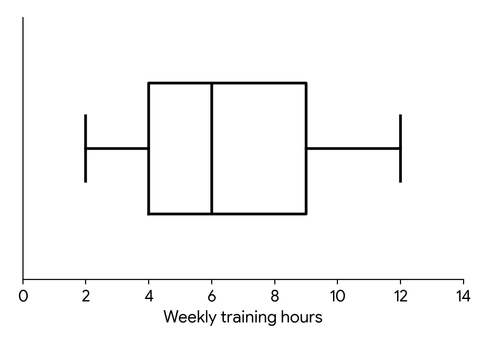
Write down the median weekly training hours.
Calculate the interquartile range for the weekly training hours.
One swimmer in the sample reported training for 15 hours per week. Dr. Sharma believes this swimmer's training time is not an outlier.
Determine whether Dr. Sharma is correct. Support your reasoning.
Dr. Sharma also collected data on the average weekly training hours () and the competition score () for a group of athletes. These data are represented on the scatter diagram.
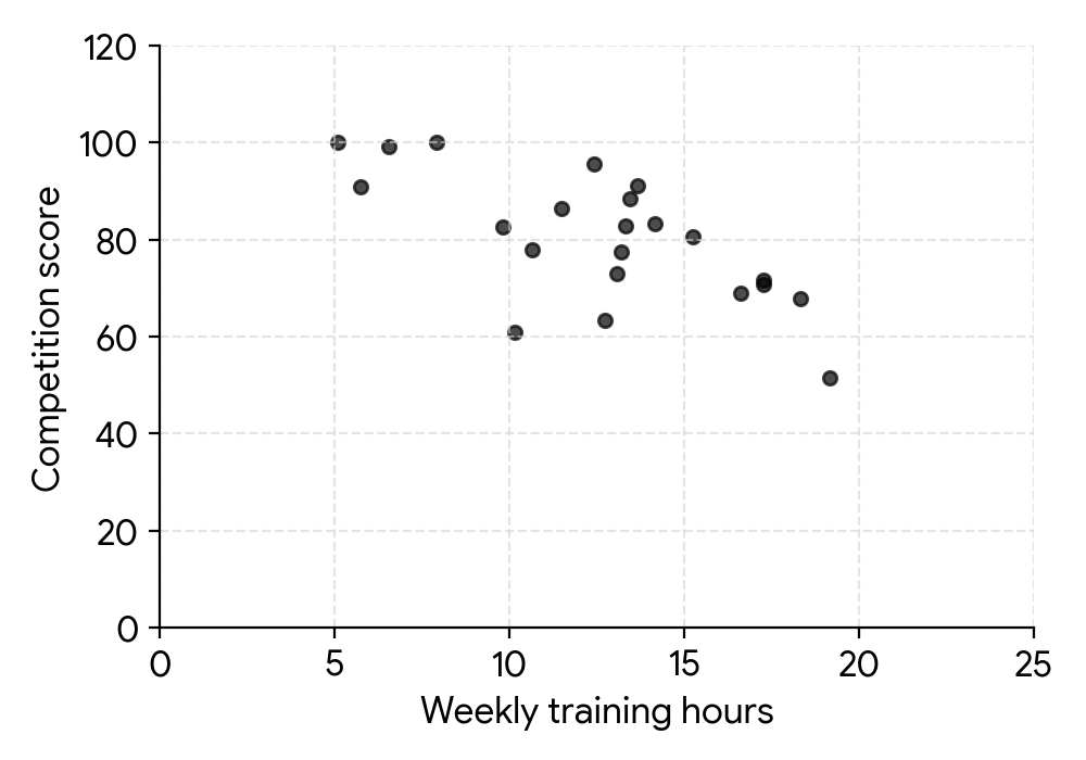
Describe the correlation between weekly training hours and competition score.
Dr. Sharma correctly calculates the equation of the regression line on for these athletes to be . She uses the equation to estimate the competition score for an athlete who trains 3 hours per week.
Find the competition score calculated by Dr. Sharma.
State whether it is valid to use the regression line on for Dr. Sharma's estimate in part (f). Give a reason for your answer, assuming the original data for training hours ranged from 5 to 20 hours.
Dr. Sharma investigated the relationship between an athlete's national competition rank and their average daily protein intake (in grams). She collected data for eight athletes, as shown in the table.
| Athlete | A | B | C | D | E | F | G | H |
|---|---|---|---|---|---|---|---|---|
| Competition Rank () | 1 | 2 | 3 | 4 | 5 | 6 | 7 | 8 |
| Protein Intake (g) () | 180 | 150 | 200 | 160 | 140 | 190 | 170 | 130 |
Dr. Sharma intends to analyse the data using Spearman's rank correlation coefficient, .
Copy and complete the information in the following table.
| Athlete | A | B | C | D | E | F | G | H |
|---|---|---|---|---|---|---|---|---|
| Rank - Competition Rank | 1 | |||||||
| Rank - Protein Intake |
Calculate the value of .
Interpret your result.
Consider how the sample is selected. Is there a systematic rule applied, or is it based on categories and targets?
The median is represented by the line inside the box of a box and whisker diagram.
The interquartile range (IQR) is the difference between the third quartile (Q3) and the first quartile (Q1).
An outlier is typically defined as a data point that falls more than 1.5 times the interquartile range (IQR) below the first quartile (Q1) or above the third quartile (Q3). Calculate the upper and lower fences.
Observe the general trend of the points on the scatter diagram. Do they tend to go up or down from left to right?
Substitute the given value of into the regression equation to find the corresponding value.
Consider if the value used for prediction falls within the range of the original data used to create the regression line.
Assign ranks to the 'Protein Intake' values. If 'Competition Rank' is already ranked from 1 to 8 (best to worst), then for 'Protein Intake', assign rank 1 to the highest intake, rank 2 to the next highest, and so on.
Use the formula for Spearman's rank correlation coefficient: , where is the difference between the ranks and is the number of data pairs.
Consider the sign and magnitude of . What does a positive or negative value mean, and what does a value close to 0 or 1 (or -1) indicate about the strength of the relationship?
Question 7
MediumPaper 1 · calculator11 marksA digital marketing agency is analyzing the relationship between weekly advertising spend and sales revenue for a new product. The following table shows the advertising spend (in thousands of dollars) and the corresponding sales revenue (in thousands of dollars) over five weeks.
Advertising Spend (in $1000s) | 2 | 4 | 6 | 8 | 10
--|---|---|---|---|---
Sales Revenue (in $1000s) | 25 | 33 | 41 | 49 | 57
Find the equation of the regression line of on .
Describe the correlation between and with reference to the value of , the Pearson's product-moment correlation coefficient.
The marketing agency plans to spend $7500 on advertising next week. Estimate the sales revenue for the product.
The agency is considering a special campaign with an advertising spend of $50000. Explain why it would be inappropriate to use the equation found in part (a) to estimate the sales revenue for this campaign.
Use your GDC's linear regression function (e.g., LinReg(ax+b) or LinReg(a+bx) ) to find the values for the slope and y-intercept. Remember to specify the dependent and independent variables correctly.
Calculate the Pearson's correlation coefficient 'r' using your GDC. Then, interpret its value in terms of strength and direction of the linear relationship.
Substitute the given advertising spend into the regression equation you found in part (a.i). Remember to consider the units (thousands of dollars).
Compare the proposed advertising spend to the range of data used to create the regression line. What is this statistical concept called?
Question 8
HardPaper 2 · calculator14 marks(a) An architect is designing a decorative archway for a park entrance. The cross-section of one half of the archway is modeled. The archway is symmetrical about the y-axis.
The architect models the base section of the archway as a straight line passing through the points and , where all units are in metres.
Find the equation of the line passing through these two points.
(b) The architect initially models the curved upper section of the archway using the following measured points:
, , , and .
(i) Find the equation of the least squares regression quadratic curve for these four points.
(ii) By considering the gradient of this curve when , explain why it may not be a good model for the archway.
(c) The architect decides that a better model for the curved section would be a quadratic curve with a maximum point at and that passes through the endpoint .
Find the equation of this new quadratic model.
(d) Believing this to be a better model for the archway, the architect wants to estimate the volume of the solid generated by rotating this half-archway about the x-axis.
(i) Write down an expression for this estimate of the volume as a sum of two integrals.
(ii) Find the value of this estimate.
Recall the formula for the gradient of a straight line given two points, and then use the point-slope form or slope-intercept form to find the equation of the line.
Use a graphing display calculator (GDC) to perform a quadratic regression on the given data points. Ensure your calculator is set to the appropriate regression type.
Calculate the gradient of the straight line from part (a) at and the gradient of the quadratic curve from part (b.i) at . Compare these values to assess the smoothness of the transition.
Use the vertex form of a quadratic equation, , where is the maximum point. Substitute the maximum point and the given endpoint to solve for the constant .
The volume of revolution about the x-axis is given by . You need to set up two integrals, one for the straight line segment and one for the quadratic curve, with their respective limits.
Evaluate the integrals from part (d.i) using your GDC. Remember to multiply by .
Question 9
MediumPaper 1 · calculator6 marksTwo renowned film critics, Alice and Bob, independently rank the artistic merit of ten independent films. The films are labelled F1 to F10, and their rankings are shown in the table below.
| Film | Alice's Rank | Bob's Rank |
|---|---|---|
| F1 | 1 | 2 |
| F2 | 2 | 1 |
| F3 | 3 | 4 |
| F4 | 4 | 3 |
| F5 | 5 | 5 |
| F6 | 6 | 7 |
| F7 | 7 | 6 |
| F8 | 8 | 9 |
| F9 | 9 | 8 |
| F10 | 10 | 10 |
Write down the rank that Alice awards film F4.
Calculate Spearman's rank correlation coefficient for these data.
Comment on your answer to part (b) in terms of the ranks awarded by Alice and Bob.
Locate film F4 in the table and find the corresponding rank given by Alice.
First, find the differences in ranks (d) for each film, then square these differences (). Finally, use the formula for Spearman's rank correlation coefficient: .
Consider what a Spearman's rank correlation coefficient close to 1 indicates about the relationship between two sets of rankings.
Question 10
HardPaper 2 · calculator17 marksEmily and Liam are researching the adoption of smart home devices in a specific region to create a model predicting future usage. They collect the following data:
| Year | Years after 2000 () | Number of devices (in thousands) () |
|---|---|---|
| 2000 | 0 | 10 |
| 2005 | 5 | 150 |
| 2010 | 10 | 400 |
| 2015 | 15 | 750 |
| 2020 | 20 | 1000 |
| 2025 | 25 | 1100 |
Emily proposes the number of devices can be modelled using quadratic regression to find a function of the form , where is the number of years after 2000.
Find the equation of Emily's model.
Emily finds the coefficient of determination for her model is to five significant figures.
State whether the coefficient of determination supports Emily's proposal. Justify your answer.
Comment on the validity of Emily's model with reference to one of the parameters in the equation.
(i) Find the value of and interpret this value in context.
(ii) By considering the changes in device adoption in the table, use the value found in part (d)(i) to comment on the validity of Emily's model.
Liam proposes that the device adoption instead follows a logistic model of the form
where is the number of years after 2000 and is the number of devices in thousands.
State a reason why it may be valid to use Liam's proposal to predict future device adoption.
(i) Find .
(ii) Hence find the year, according to Liam's model, during which the greatest device adoption growth rate occurred.
Use your GDC's regression features (e.g., QuadraticReg) to find the coefficients , , and . Ensure you input the 'Years after 2000' as your -values and 'Number of devices (in thousands)' as your -values.
Recall what a coefficient of determination () value close to 1 indicates about the model's fit to the data.
Consider the real-world implications of the values of or in the context of device adoption. Can the number of devices be negative, or can it decrease indefinitely?
For (i), differentiate with respect to to find , then substitute . The derivative represents the rate of change. For (ii), compare the model's predicted rate of change with the actual data in the table, especially for the period around .
Think about the long-term behaviour of logistic models, especially in the context of growth phenomena like technology adoption.
For (i), use the chain rule or quotient rule to differentiate . Remember that . For (ii), the maximum growth rate for a logistic function occurs when , where is the coefficient of in the denominator.
Question 11
MediumPaper 1 · calculator11 marksA manufacturing company is investigating the relationship between a worker's years of experience and their daily production output. They randomly selected five workers and recorded their years of experience () and their average daily production output (, in units).
The data is shown in the following table:
| Years of Experience () | Daily Production Output () |
|---|---|
| 1 | 106 |
| 3 | 114 |
| 5 | 126 |
| 7 | 134 |
| 9 | 147 |
The company believes there might be a linear relationship between a worker's experience and their production output.
(a)(i) Find the Pearson's product moment correlation coefficient, , for this data.
(a)(ii) Find the equation of the least squares regression line of on for this data.
(b) According to this model, calculate how many more units a worker would produce daily if they had an extra 2.5 years of experience.
(c) State one reason why the value obtained in part (b) might not be valid for all workers.
Use your GDC's statistics functions to calculate the Pearson's product moment correlation coefficient. Ensure you input the data correctly into two lists.
Use your GDC's linear regression (a+bx or ax+b) function. Remember to identify which variable is independent () and which is dependent ().
Consider what the slope of the regression line represents in this context. An 'extra' amount of the independent variable directly relates to the slope.
Think about factors other than experience that could affect a worker's production output, or limitations of linear models in real-world scenarios.
Question 12
HardPaper 3 · calculator24 marksMs. Anya Sharma, a school principal, wants to investigate if the number of hours students spend studying affects their exam scores. This question asks you to review Ms. Sharma's methods and conclusions.
Ms. Sharma obtained a list of students from her school. She contacted them and asked them to fill in an anonymous questionnaire. Participants were asked to state their weekly study hours and their most recent exam score (out of 100). Of the 250 students on the list, 11 replied.
Ms. Sharma's results are summarized in the following table:
| Student ID | Weekly Study Hours (X) | Exam Score (Y) |
|---|---|---|
| 1 | 5 | 50 |
| 2 | 7 | 65 |
| 3 | 8 | 60 |
| 4 | 10 | 78 |
| 5 | 12 | 70 |
| 6 | 6 | 55 |
| 7 | 9 | 72 |
| 8 | 11 | 80 |
| 9 | 4 | 45 |
| 10 | 13 | 85 |
| 11 | 18 | 60 |
Describe one way in which Ms. Sharma could improve the reliability of her investigation.
Describe one criticism that can be made about the validity of Ms. Sharma's investigation.
Ms. Sharma classifies Student 11 as an outlier and removes their data from the analysis. Suggest one possible justification for her decision to remove it.
For the remaining ten student responses in the table, Ms. Sharma calculates the mean exam score to be . Calculate the mean weekly study hours for these remaining responses.
Determine the value of , Pearson's product-moment correlation coefficient, for these remaining responses.
Ms. Sharma decides to carry out a hypothesis test on the correlation coefficient to investigate whether increased weekly study hours are associated with higher exam scores. State why the hypothesis test should be one-tailed.
State the null and alternative hypotheses for this test.
The critical value for this test, at the 5% significance level, is 0.549. Ms. Sharma assumes that the population is bivariate normal. Determine whether there is significant evidence of a positive correlation between weekly study hours and exam scores. Justify your answer.
Ms. Sharma wants to create a model to predict how changing weekly study hours might affect exam scores. To do this, she assumes that weekly study hours, , is the independent variable and the exam score, , is the dependent variable.
She first considers a linear model of the form . Use Ms. Sharma's data to find the value of and of .
Interpret, referring to study hours and exam scores, what the value of represents.
Ms. Sharma then considers a quadratic model of the form . Find the value of , of and of .
Find the coefficient of determination for each of the two models she considers.
Hence compare the two models.
Ms. Sharma decides to use the coefficient of determination to choose between these two models. Comment on the validity of her decision.
After presenting the results of her investigation, a colleague questions whether Ms. Sharma's sample is representative of all students in the school. A report states that the mean weekly study hours for all students in the school is hours. Ms. Sharma decides to carry out a test to determine whether her sample could realistically be taken from a population with a mean of hours. State the name of the test which Ms. Sharma should use.
State the null and alternative hypotheses for this test.
Perform the test, using a 5% significance level, and state your conclusion in context.
Reliability concerns the consistency and repeatability of the results. How can she ensure her measurements are more consistent or less prone to random error?
Validity concerns whether the study measures what it intends to measure and whether the results are generalizable. Are there other factors influencing exam scores? Is "study hours" accurately measured?
Look at the data for Student 11 compared to the general trend. What makes it unusual?
Sum the weekly study hours for the remaining students and divide by .
Use your GDC's statistical functions to calculate Pearson's for the data points (excluding Student 11).
Consider the specific direction of the relationship Ms. Sharma is investigating.
The null hypothesis typically states no effect or no relationship, while the alternative hypothesis states the effect or relationship you are looking for. Use the correct symbol for population correlation.
Compare your calculated value from part (c.ii) with the given critical value.
Use your GDC's linear regression function (LinReg(ax+b) ) with the data points.
The coefficient in a linear model represents the change in for every one-unit increase in .
Use your GDC's quadratic regression function (QuadReg) with the data points.
The coefficient of determination, , is often provided by your GDC along with the regression equation. For the linear model, .
A higher value generally indicates a better fit for the data.
tends to increase with the number of independent variables or parameters in a model, even if the additional terms do not significantly improve the model's predictive power.
This is a test comparing a sample mean to a known population mean when the population standard deviation is unknown (which is usually the case).
The null hypothesis assumes the sample comes from the population with the stated mean. The alternative hypothesis states it does not.
Use your GDC's t-test function (T-Test) for one sample. Input the sample data (study hours), the hypothesized population mean, and the significance level.
Question 13
MediumPaper 1 · calculator9 marksBrew & Bloom, a local coffee shop, decided to investigate if there was any correlation between their daily coffee sales and the average daily hours of sunlight. They collected the following data over 12 days:
Day | Hours of Sunlight () | Coffee Sales (, in units)
---|---|---
1 | |
2 | |
3 | |
4 | |
5 | |
6 | |
7 | |
8 | |
9 | |
10 | |
11 | |
12 | |
(a) Plot the given points on a scatter diagram.
(b) Calculate the coordinates of the mean point and hence draw a line of best fit on your scatter diagram from part (a).
(c) Calculate Pearson's Product Moment Correlation Coefficient for this data, and interpret your result.
(d) Comment on whether the coffee shop owner can conclude, from this data, that daily hours of sunlight directly affect coffee sales.
Remember to label your axes clearly and choose an appropriate scale for both the hours of sunlight and coffee sales.
To find the mean coordinates, sum all the values for each variable and divide by the number of data points. The line of best fit should pass through this mean point and follow the general trend of the data.
Use your GDC to calculate Pearson's r. Remember that the interpretation should describe the strength and direction of the linear relationship.
Consider the difference between correlation and causation. Does a strong correlation automatically mean one variable causes the other?
Question 14
HardPaper 3 · calculator28 marks(a) TechInnovate is considering collecting more data for their analysis.
(i) State one advantage of increasing the sample size.
(ii) State one disadvantage of increasing the sample size.
(b) The production manager at Plant Alpha recorded the time, in minutes, taken to produce a batch of electronic components for 10 randomly selected batches:
Find the value of for this sample from Plant Alpha.
(c) A manager claims that Plant Alpha's production times are more consistent than Plant Beta's. Given that the sample standard deviation () for Plant Beta's production times is minutes, make one criticism of this claim.
(d) TechInnovate wants to compare the mean production times of Plant Alpha and Plant Beta using a pooled t-test.
(i) State the condition regarding population variances required to use a pooled t-test.
(ii) Given that for Plant Beta, a sample of batches yielded a mean production time of minutes and a sample standard deviation of minutes, state whether TechInnovate should use a pooled t-test in this case. Justify your answer.
(e) TechInnovate believes Plant Alpha has a lower mean production time than Plant Beta.
(i) State appropriate null and alternative hypotheses for the pooled t-test.
(ii) Find the p-value.
(iii) Given that the test is carried out at the 5% significance level, state the appropriate conclusion in context. Justify your answer.
(f) The company also investigates the relationship between operator experience (in years) and the number of defective items produced per day. A sample of 8 operators yielded the following data:
| Operator Experience (years) | Number of Defective Items |
|---|---|
| 2 | 15 |
| 5 | 10 |
| 3 | 13 |
| 8 | 7 |
| 1 | 18 |
| 6 | 9 |
| 4 | 12 |
| 7 | 8 |
(i) Assuming all requirements are met, perform a test at the 5% significance level to determine if there is a linear correlation between operator experience and the number of defective items. State the hypotheses and justify your conclusion.
(ii) If the requirements for this test are not met, state an alternative test that could be used.
(g) For the data in (f.i), the equation of the least squares regression line of defective items () on operator experience () is . Give, in context, an interpretation of the gradient in this model.
(h) TechInnovate uses a baseline model to predict the number of defective items () for a batch based on its size (): . The "Quality Deviation" () for a batch is defined as . A positive Quality Deviation indicates better-than-expected quality.
(i) Show that for a batch of components from Plant Beta that produced defective items, the Quality Deviation is .
(ii) To compare quality control, samples of Quality Deviation scores were collected:
- Plant Alpha: , ,
- Plant Beta: , ,
Assuming that the appropriate requirements are met, use a pooled t-test at a 5% significance level to determine if the mean Quality Deviation is higher in Plant Alpha than in Plant Beta. Write down your null and alternative hypotheses and justify your conclusion.
(i) Using the results from parts (e) and (h.ii), explain how each plant could claim they are performing better than the other plant.
Think about how a larger sample relates to the overall population.
Consider the practical implications of collecting more data.
Use your GDC to calculate the sample standard deviation ( or ).
Consider the nature of sample statistics versus population parameters, especially when values are close.
Recall the assumption about variances for a pooled t-test.
Compare the sample standard deviations of Plant Alpha (from part b) and Plant Beta.
Remember to define your parameters and specify the direction of the alternative hypothesis.
Use your GDC to perform a two-sample t-test with pooled variance, then adjust for the one-tailed hypothesis.
Compare the p-value with the significance level and relate it back to the original claim about production times.
Calculate the Pearson product-moment correlation coefficient () and its associated p-value. Formulate hypotheses for population correlation ().
Consider non-parametric alternatives for correlation when assumptions for Pearson's are violated.
The gradient represents the change in the dependent variable for a one-unit change in the independent variable.
First, calculate the predicted number of defective items using the model. Then, apply the definition of Quality Deviation.
Formulate hypotheses for the population mean Quality Deviation. Perform a one-tailed pooled t-test using your GDC.
Review the conclusions of the two t-tests. One test might favor Plant Alpha, while the other might not show a significant difference, which Plant Beta could use to their advantage.
Question 15
MediumPaper 2 · calculator7 marksA small online retail company, 'GadgetHub', tracks its daily advertising expenditure and the corresponding number of units sold for a new product over a period of ten days.
| Daily Advertising Spend (USD), | Units Sold, |
|---|---|
Draw a scatter graph to represent this information. Label the axes clearly.
Describe the correlation between daily advertising spend and units sold.
State whether you think the daily advertising spend has an effect on the number of units sold. Give a reason for your answer.
Remember to label your axes with the correct variables and units. Plot each data point accurately according to its coordinates.
Consider the direction (positive/negative), strength (strong/moderate/weak), and form (linear/non-linear) of the relationship shown in your scatter graph.
Based on the correlation you described in part (b), what can you infer about the relationship between the two variables? Does an increase in one variable seem to be associated with an increase or decrease in the other?
Question 16
HardPaper 3 · calculator27 marksA botanical garden is researching the growth of a rare orchid species, Orchidaceae splendens, in a controlled greenhouse environment. They are investigating the long-term viability of maintaining a large population.
The population of Orchidaceae splendens, , measured in thousands, is shown in the following table. The time is measured in years from the beginning of 2010, where .
| End of year | (thousands) | |
|---|---|---|
| 2010 | 1 | 0.5 |
| 2011 | 2 | 0.8 |
| 2012 | 3 | 1.0 |
| 2013 | 4 | 1.4 |
| 2014 | 5 | 1.9 |
| 2015 | 6 | 2.6 |
| 2016 | 7 | 4.0 |
The garden models this data set using the logistic function , where .
In context, explain the significance of in this logistic function.
Use the value of at to show that .
Use the value of at to find a second expression for .
Use your answers to part (b) to find a value for .
Use your answers to part (b) to find a value for .
The botanical garden uses its model to predict values of at the end of the years 2011 to 2015. These values are shown in the following table, correct to one decimal place.
| End of year | (actual, thousands) | Predicted values (thousands) | |
|---|---|---|---|
| 2011 | 2 | 0.8 | 0.7 |
| 2012 | 3 | 1.0 | 1.0 |
| 2013 | 4 | 1.4 | |
| 2014 | 5 | 1.9 | 2.0 |
| 2015 | 6 | 2.6 | 2.8 |
Calculate the value of correct to one decimal place.
Using the value of correct to one decimal place, find the sum of square residuals, , when using this model to predict the values of .
As a measure of how well the model fits the data, the botanical garden uses the error function, , where , and is the number of predictions made using the model.
The garden decides they will use this model if is less than .
By finding the value of for the model, show that the garden will decide that the model can be used.
Use the model to predict the population of Orchidaceae splendens in the greenhouse at the end of 2025.
One of the challenges in maintaining the orchid population is providing sufficient specialized protective covers. The botanical garden estimates that of orchids will require a specialized protective cover, and each cover can protect individual orchids.
Use the model to find an expression for the total number of specialized protective covers required at time . Give your answer in thousands of covers.
At the end of 2014 () there were thousand specialized protective covers in the greenhouse, and at the end of 2016 () there were thousand.
Find the average number of specialized protective covers installed per year during this period.
The botanical garden assumes that the number of specialized protective covers will continue to increase linearly, at the same rate, until the population stabilizes.
Determine the value of , where , at which the number of specialized protective covers will first be insufficient to meet demand, and hence the year in which this occurs.
Consider what the value of approaches as becomes very large in a logistic model.
Substitute the given values for and into the logistic function and rearrange the equation to isolate .
Similar to part (b.i), substitute the values for and at and rearrange to express in terms of .
You have two expressions for . Set them equal to each other and solve for . Remember to use logarithms to solve for when it's in the exponent.
Substitute the value of you found in part (c.i) into either of your expressions for from part (b).
The value is the predicted population at . Substitute into your logistic function using the values of and you found.
The residuals are the differences between the actual and predicted values. Square each residual and then sum them up. Remember to use the rounded predicted values from the table.
Use the value you calculated and the number of predictions () to find . Then compare to the threshold of .
First, determine the value of that corresponds to the end of 2025. Then, substitute this value into your logistic function.
Calculate the total number of orchids requiring covers, then divide by the capacity of each cover. Remember to keep units consistent (thousands).
Calculate the change in the number of covers and divide by the change in years.
First, create a linear equation for the supply of covers based on the information in part (i). Then, set the demand for covers (from part h) equal to the supply of covers and solve for . You may need to use your GDC to solve this equation graphically or numerically. Finally, convert the value of to the corresponding year.
Question 17
MediumPaper 1 · calculator11 marksA market research firm collected paired, bivariate data on advertising spend and weekly product sales for a new item. The data showed a strong linear relationship, and the on line of best fit is given by .
When the advertising spend is thousand dollars (), the estimated weekly sales are thousand units ().
When the advertising spend is thousand dollars (), the estimated weekly sales are thousand units ().
(a) Find the value of
(i)
(ii)
(b) State whether the correlation is positive or negative.
(c) Given that the advertising spend is thousand dollars, find the estimated weekly sales.
(d) When advertising spend is thousand dollars, find an estimate for the weekly sales.
Recall the formula for the gradient (slope) of a line given two points: .
Once you have the value of , substitute one of the given points and into the equation to solve for .
Consider the sign of the slope (). A positive slope indicates a positive correlation, while a negative slope indicates a negative correlation.
Use the equation of the line of best fit, , with the values of and you found in part (a), and substitute the given value.
Similar to part (c), substitute the new value into the line of best fit equation.
Question 18
MediumPaper 2 · calculator12 marksA team of agricultural researchers is investigating the effectiveness of a new soil nutrient on crop yield. They conducted an experiment on 8 plots of land, varying the amount of nutrient applied ( grams per square meter) and measuring the resulting crop yield ( kg per square meter).
The data is given in the table below.
| Nutrient amount () | Crop yield () |
|---|---|
| 10 | 12.1 |
| 15 | 14.8 |
| 20 | 17.5 |
| 25 | 19.9 |
| 30 | 22.3 |
| 35 | 25.0 |
| 40 | 27.6 |
| 45 | 30.2 |
(a) (i) Calculate the Pearson product moment correlation coefficient for this data, correct to three significant figures.
(ii) In two words, describe the linear correlation that is exhibited by this data.
(iii) Calculate the on line of best fit in the form , giving the values of and correct to three significant figures.
The research team conducted a follow-up experiment on 4 additional plots, which were located in a different region with slightly different soil conditions. This extra data is given in the table below.
| Nutrient amount () | Crop yield () |
|---|---|
| 12 | 10.5 |
| 28 | 18.0 |
| 38 | 20.0 |
| 48 | 21.5 |
(b) (i) Calculate the Pearson product moment correlation coefficient for the combined data of all 12 plots, correct to three significant figures.
(ii) In two words, describe the linear correlation that is exhibited by the combined data.
(iii) Suggest a reason why it may not be valid to calculate the on line of best fit for the combined data.
Use your GDC's statistics function to calculate the Pearson product moment correlation coefficient (r). Ensure you input the x and y values correctly.
Consider both the strength and direction of the correlation coefficient you calculated in part (a)(i).
Use your GDC's linear regression function (often 'LinReg(ax+b)'). Make sure to identify which value is 'a' (slope) and which is 'b' (y-intercept).
Combine all 12 pairs of (x, y) values into a single dataset before calculating the Pearson correlation coefficient using your GDC.
Again, consider the strength and direction of the new correlation coefficient.
Think about how the additional data points relate to the original data. Does the overall pattern still look consistently linear, or are there different trends present?
Question 19
MediumPaper 2 · calculator7 marksA student is investigating the relationship between the number of hours spent studying for a particular subject and the score achieved in the exam for that subject. They collected data from 10 classmates:
Hours Studied (hours) | Exam Score
---|---
2 | 54
3 | 55
4 | 66
5 | 67
6 | 68
7 | 74
8 | 81
9 | 78
10 | 86
11 | 94
Draw a scatter graph to represent this information.
Describe the correlation between the hours studied and the exam score.
Comment on whether the number of hours studied has an effect on the exam score.
Remember to label your axes clearly with units and choose an appropriate scale for both the hours studied and the exam scores. Plot each data point accurately.
Consider both the direction (positive or negative) and the strength (strong, moderate, or weak) of the relationship shown in your scatter graph.
Refer to your description of the correlation. Does an increase in one variable generally lead to an increase or decrease in the other? Also, consider if correlation always implies causation.
Question 20
MediumPaper 1 · calculator12 marksA market research firm is studying the relationship between advertising expenditure (, in thousands of dollars) and monthly product sales (, in thousands of units) for a new gadget. They found that the paired bivariate data shows a strong linear correlation, modelled by the -on- line of best fit .
When the advertising expenditure is thousand dollars, the estimated monthly sales are thousand units. When the advertising expenditure is thousand dollars, the estimated monthly sales are thousand units.
(a) Find the values of:
(i)
(ii)
(b) State whether there is positive or negative correlation.
(c) The market research firm plans an advertising expenditure of thousand dollars. Find the estimated monthly sales, in thousands of units.
(d) When the advertising expenditure is thousand dollars, find an estimate for the monthly sales, in thousands of units, given that this is an example of interpolation.
Use the two given points to find the gradient of the line of best fit. Remember the formula for the gradient .
Now that you have the value of , substitute it into one of the point-slope equations to solve for .
Consider the sign of the gradient () you found. A positive gradient indicates one type of correlation, while a negative gradient indicates another.
Use the equation of the line of best fit, , with the values of and you found and the given value.
Interpolation means estimating a value within the range of the observed data. Apply the line of best fit equation again.
No question on this page matches those filters. Try another difficulty or paper.
16 more Linear Correlation of bivariate data (scatter diagrams, lines of best fit, Pearson) + regression line interpretation questions in the app
Every answer is marked mark by mark, IB-style, and the AI tutor helps when you are stuck.
Where marks are lost
- Rounding an intermediate value and then using it in a later part. Costs a mark every time, and AI's multi-part modelling questions give it more chances to happen than AA's shorter, more self-contained ones.
- Using your own wrong value after failing a "show that." All follow through is withdrawn for the rest of that question.
- Leaving an answer in calculator notation. Never accepted in a final answer, and AI's constant calculator use makes this the easiest slip in the whole subject.