Presentation of data (frequency distribution tables, histograms, box & whisker, cumulative frequency graphs + finding median quartiles, percentiles, range, iqr): notes and practice questions
- Frequency distribution tables organize data into intervals (bins) with corresponding frequencies.
- Histograms represent data as bars to show frequency distribution.
- Box and whisker plots display the median, quartiles, and range, with whiskers showing data spread.
- Cumulative frequency graphs plot the cumulative sum of frequencies.
- Median, quartiles, percentiles, range, and interquartile range (IQR) describe the distribution and spread of data.
Median = middle value, Quartiles = data split into quarters, IQR = Q3 - Q1.
How it is examined
Reading values off a cumulative frequency graph, then building a box plot, is the standard chain. The "not required" line matters: unequal class widths and frequency density are out, so every histogram in a generated question must have equal class intervals. Paper 2, 5 to 8 marks.
- Presentation of data (discrete and continuous): frequency distributions (tables).
- Histograms.
- Cumulative frequency; cumulative frequency graphs; use to find median, quartiles, percentiles, range and interquartile range (IQR).
- Production and understanding of box and whisker diagrams.
Not required: frequency density histograms.
Linking questions
- Links to other subjects: presentation of data (sciences, individuals and societies).
Practice questions
22 questions · 1 easy · 20 medium · 1 hardQuestion 1
EasyPaper 1 · no calculator6 marksThe box plot below shows the time, in minutes, taken by a group of students to complete a crossword puzzle.
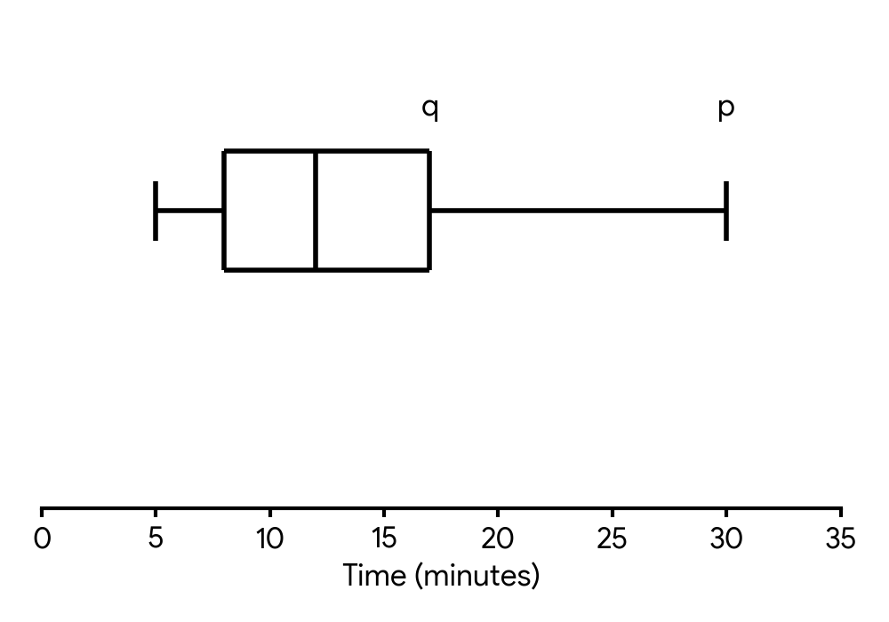
(a) Write down the median time.
(b) Write down the minimum time.
(c) The range of the times is minutes. Find the value of .
(d) The interquartile range is minutes. Find the value of .
The median is represented by the line inside the box of the box plot. Read the value from the axis that corresponds to this line.
The minimum value is represented by the end of the leftmost 'whisker' of the box plot. Read the value from the axis that corresponds to this point.
Recall the definition of the range of a data set. It is the difference between the maximum and minimum values. Set up an equation using the given range and the minimum value you found in part (b).
Recall the definition of the interquartile range (IQR). It is the difference between the upper quartile () and the lower quartile (). You can read the value of from the box plot.
Question 2
MediumPaper 1 · no calculator5 marksA group of students were timed in minutes on how long it took them to solve a logic puzzle. The results are summarized in the following box and whisker diagram, where and represent the lower and upper quartiles respectively.
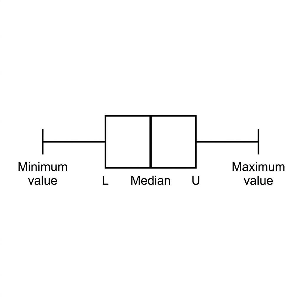
The interquartile range is 8 minutes, and the minimum time recorded was 5 minutes. There are no outliers in the data.
(a) Find the maximum possible value of .
(b) Hence, find the maximum possible value of .
Recall the formula for determining a lower outlier. The minimum value of the data set must not be an outlier. Set up an inequality using this information.
The interquartile range is the difference between the upper and lower quartiles. Use your answer from part (a) to find the corresponding value for U.
Question 3
HardPaper 2 · calculator18 marksIn a large university, 200 students were surveyed. Of those, 120 were undergraduates (U) and the rest postgraduates (P).
Each student in the survey was asked whether they preferred quiet zones (Q) or collaborative areas (C) for studying. It was found that 75 of the undergraduates preferred quiet zones. The total number of students who preferred collaborative areas was 100. This information is shown in the following table.
| Quiet Zones (Q) | Collaborative Areas (C) | Total | |
|---|---|---|---|
| Undergraduates (U) | 75 | p | 120 |
| Postgraduates (P) | x | 55 | 80 |
| Total | q | 100 | 200 |
Find the value of
;
.
Three students are chosen at random from those surveyed. Find the probability that all three are postgraduates.
Given that , find the value of .
A student is chosen at random from those surveyed. Write down the probability that they are a postgraduate who prefers quiet zones.
Determine if the events P (Postgraduate) and Q (prefers Quiet Zones) are independent. Justify your answer.
It can be assumed that the survey results are representative of the university population. Ten students from the university are chosen at random. Find the probability that at least five of them prefer quiet zones.
Use the row total for undergraduates and the number of undergraduates preferring quiet zones to find .
Use the grand total and the total number of students preferring collaborative areas to find .
Remember that once a student is chosen, they are not replaced. This affects the total number of students and postgraduates for subsequent selections.
Recall the formula for conditional probability: . In this case, .
This is a direct probability from the completed table. Look for the cell representing postgraduates who prefer quiet zones and divide by the total number of students.
Two events A and B are independent if or if . Calculate these probabilities using your table values.
This scenario involves a fixed number of trials (10 students) and a probability of success (preferring quiet zones) for each trial. Consider which probability distribution is appropriate.
Question 4
MediumPaper 1 · no calculator7 marksA biologist is studying a species of fish. The length, cm, and weight, g, of each fish in a sample are recorded.
The lengths of the fish are summarized in the following box and whisker diagram.
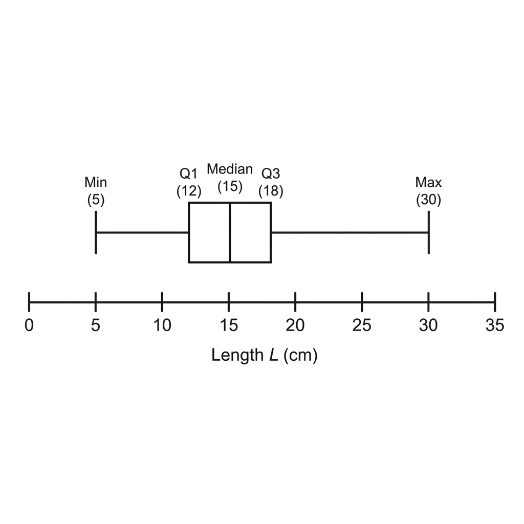
Find the largest value of that would not be considered an outlier.
The regression line of on is . The regression line of on is .
One of the fish in the sample weighs 200 g. Estimate the length of this fish.
Find the mean weight of the fish in the sample.
An outlier is defined as a data point that is more than 1.5 times the interquartile range (IQR) above the upper quartile or below the lower quartile. First, calculate the IQR.
You are given the weight () and asked to estimate the length (). You should use the regression line that predicts from .
The point , representing the mean length and mean weight, is the intersection point of the two regression lines.
Question 5
MediumPaper 1 · no calculator5 marksA sports scientist records the time, in seconds, for a group of athletes to run 400 metres. The results are summarized in the following box and whisker diagram, where and are the lower and upper quartiles respectively.
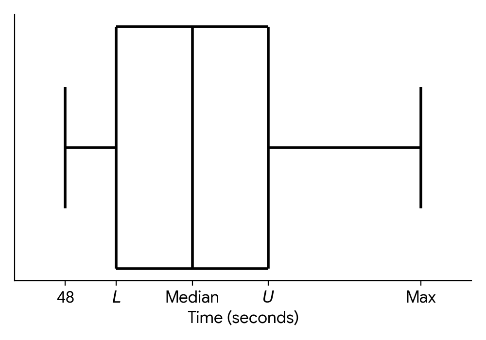
The interquartile range is 6 seconds and there are no outliers in the data.
(a) Find the maximum possible value of .
(b) Hence, find the maximum possible value of .
Recall the formula for determining lower outliers. Since there are no outliers, the minimum recorded time must be greater than or equal to the lower outlier boundary. Use this to set up an inequality involving .
Use the relationship between the interquartile range (IQR), the lower quartile (), and the upper quartile (). You will need your answer from part (a).
Question 6
MediumPaper 1 · no calculator15 marksA tech company is testing the battery life of its new smartphone. A sample of 120 phones are tested to see how long their batteries last under continuous video playback. The results are shown in the cumulative frequency graph below.
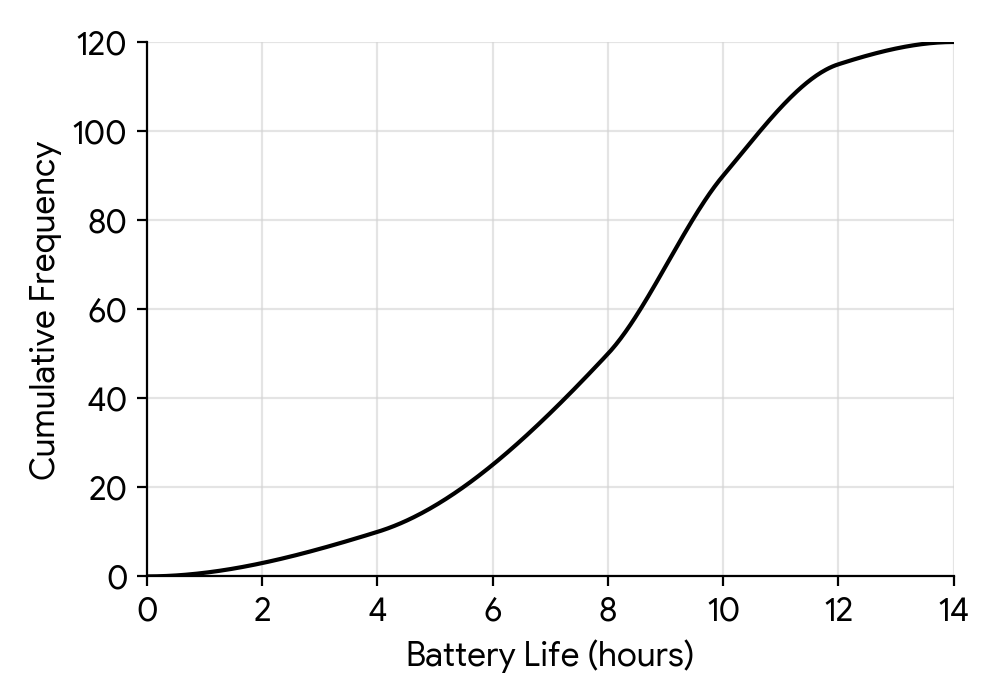
(a) Find the median battery life.
(b) The lowest 25% of battery lives in the sample are less than hours. Find the value of .
(c) The same data is represented by the following frequency table.
| Battery Life (h) | ||||
|---|---|---|---|---|
| Frequency | 10 | 5 |
Find the value of and the value of .
(d) The company manufactures a batch of 10,000 of these smartphones. Estimate the number of phones in the batch that will have a battery life of more than 10 hours.
(e) The company wishes to advertise the 'typical' battery life of the phone based on this test.
(i) Explain why this testing method might not provide an accurate representation of the battery life for a typical user.
(ii) Suggest a more appropriate method for testing the battery life to represent a typical user.
The median is the value for the middle data point. In a cumulative frequency graph with N data points, this corresponds to the value on the x-axis for a cumulative frequency of N/2.
This question is asking for the lower quartile (Q1). First, calculate the cumulative frequency corresponding to the 25th percentile, and then find the corresponding value on the x-axis from the graph.
The cumulative frequency is the running total of the frequencies. To find the frequency for a specific interval, you need to subtract the cumulative frequency at the start of the interval from the cumulative frequency at the end of the interval.
First, use the graph to find the number of phones in the sample with a battery life of more than 10 hours. Then, use this proportion to estimate the number for the entire batch of 10,000 phones.
Think about how you use your own phone. Is it always for continuous video playback? What other activities affect battery life?
How could the company make the test more realistic?
Question 7
MediumPaper 1 · no calculator7 marksA study was conducted to investigate the relationship between the number of hours, , a student spends studying for an exam and their score, (%), in that exam.
The number of hours spent studying is summarized in the following box and whisker diagram.
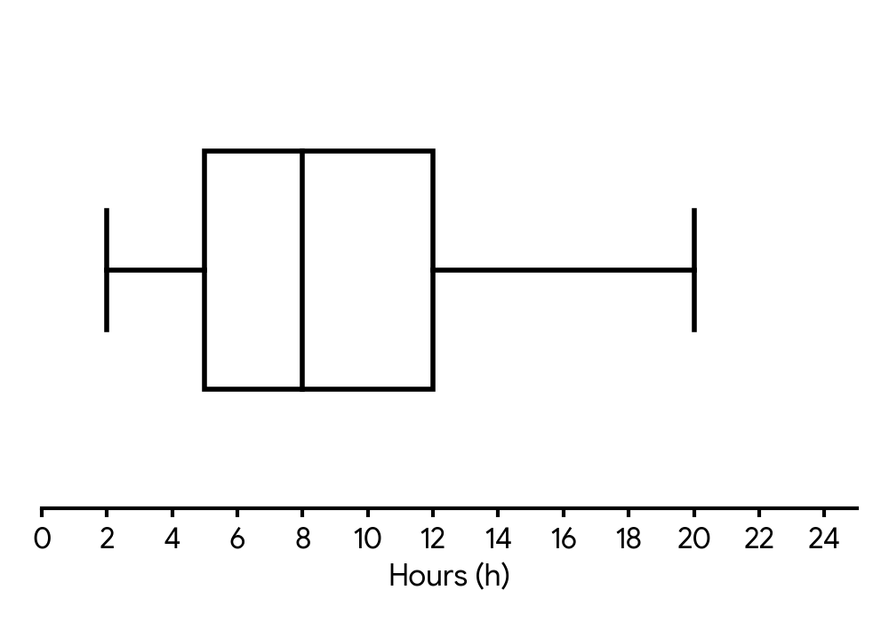
(a) Find the largest value of that would not be considered an outlier.
The regression line of on is . The regression line of on is .
(b) (i) One of the students scored 90% on the exam. Estimate the number of hours they studied.
(ii) Find the mean score of all the students in the study.
Recall the formula for identifying outliers using the interquartile range (IQR). The upper boundary is calculated as .
You are given the exam score () and asked to estimate the hours studied (). You should use the regression line of on .
The point representing the mean hours and mean score lies on both regression lines. You need to find the intersection point of the two lines.
Question 8
MediumPaper 1 · no calculator21 marksA new coffee shop records the number of customers, , per hour during its 120 opening hours in a week. The number of customers per hour is shown in the following frequency table.
| Number of customers () | Frequency (hours) |
|---|---|
| 15 | |
| 28 | |
| 22 | |
| 13 |
(a) Find the value of .
(b) Write down the modal class.
The following cumulative frequency diagram also displays these data.
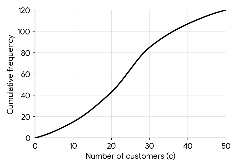
(c) Use the cumulative frequency curve to estimate the median number of customers per hour.
(d) The coffee shop is considered 'busy' when there are more than 35 customers. Use the cumulative frequency curve to estimate the number of hours the coffee shop was busy.
The coffee shop manager wants to survey customers about their experience.
(e) State one disadvantage of surveying only the customers who arrive between 8 am and 9 am on a Monday.
(f) Describe how the manager could use systematic sampling to survey customers throughout a single day.
The total number of customers for the week was 2900. The following box and whisker diagram displays the amount of money, in USD, spent by customers during their visit.
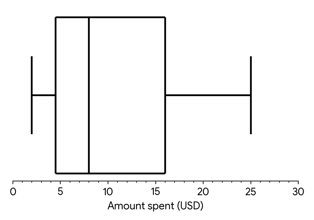
(g) Estimate the number of customers who spent between $4.50 and $16.
(h) The top 25% of customers spent more than USD. Find the value of .
The following week, a new promotion is introduced, which is expected to attract an additional 3 customers per hour.
(i) Calculate the new mean number of customers per hour.
(j) State, with a reason, the effect this increase would have on the range of the number of customers per hour.
The total frequency is given in the question. The sum of the frequencies in the table must equal this total.
The modal class is the class interval with the highest frequency.
The median is the value corresponding to 50% of the total frequency. Find this value on the cumulative frequency axis and read the corresponding value on the horizontal axis.
First, find the cumulative frequency for 35 customers from the graph. This tells you how many hours had 35 or fewer customers. Then, use the total number of hours to find how many hours had more than 35 customers.
Consider whether this group of customers is representative of all customers who visit the coffee shop at different times and on different days.
Systematic sampling involves selecting items at regular intervals from an ordered list. How could you apply this to customers entering a shop?
Identify what $4.50 and $16 represent on the box and whisker diagram. What percentage of the data lies between these two values?
The 'top 25%' corresponds to a specific feature of the box and whisker plot. Which one is it?
First, calculate the original mean number of customers per hour. Then, consider how adding 3 to each hourly count affects this mean.
The range is the difference between the maximum and minimum values. If every data point increases by 3, what happens to the maximum value? What happens to the minimum value? What happens to their difference?
Question 9
MediumPaper 2 · calculator4 marksThe daily commute time to work (in minutes) for a group of employees is shown in the following table.
| Commute time (minutes) | Number of employees |
|---|---|
| 10 | 4 |
| 15 | x |
| 20 | 7 |
| 25 | 5 |
| 30 | 3 |
The median commute time is 17.5 minutes.
Find the value of x.
| Commute time (minutes) | Number of employees |
|---|---|
| 10 | 4 |
| 15 | x |
| 20 | 7 |
| 25 | 5 |
| 30 | 3 |
Using the value of x found in part (a), find the standard deviation of the commute times.
The median of 17.5 minutes indicates that the two middle values in the ordered data set are 15 and 20. Consider the total frequency and the cumulative frequencies up to these values.
Use your GDC's statistics functions for grouped data, or apply the formula for standard deviation. Remember to use the value of x you found in part (a).
Question 10
MediumPaper 2 · calculator6 marksA botanist conducted an experiment to compare the growth of a particular plant species under two different lighting conditions: natural sunlight and artificial grow lights. A random sample of 10 plants was grown under each condition for a month, and their increase in height (in cm) was recorded.
The box and whisker diagrams for the height increase are shown below.
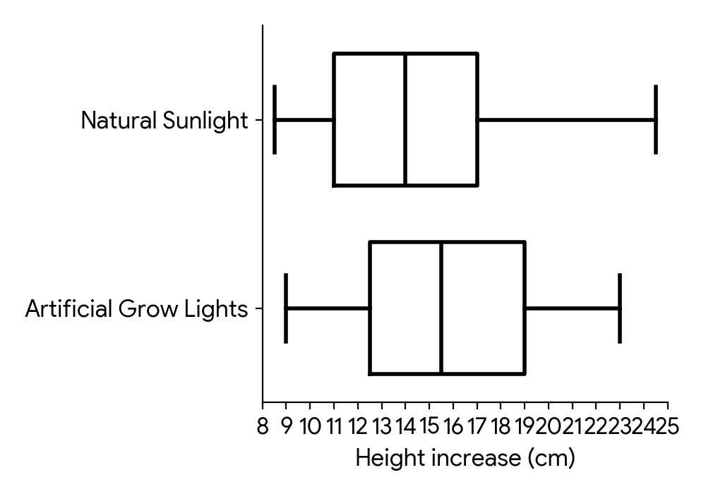
Consider the box and whisker diagram representing the height increase for plants grown in natural sunlight.
(a) State the median height increase for plants grown in natural sunlight.
(b) Verify that the measurement of 24.5 cm is not an outlier for plants grown in natural sunlight.
(c) For plants grown in natural sunlight, state why it appears that the mean height increase is greater than the median height increase.
(d) Now consider the two box and whisker diagrams. Comment on whether these box and whisker diagrams provide any evidence that might suggest that artificial grow lights cause an increase in plant height.
The median is represented by the line inside the box of the box and whisker diagram.
Recall the formula for identifying outliers: values outside or are considered outliers. Calculate the Interquartile Range (IQR) first.
Consider the symmetry of the distribution. Where is the median located within the box, and how do the lengths of the whiskers compare?
Compare the key features (median, quartiles, spread) of the two distributions. Is one distribution generally shifted higher than the other?
Question 11
MediumPaper 2 · calculator8 marksA customer service center recorded the number of calls received per hour over several days. The data is presented in the following cumulative frequency table.
| Number of calls (x) | Frequency (f) | Cumulative Frequency (cf) |
|---|---|---|
| 0 | 5 | 5 |
| 1 | 12 | 17 |
| 2 | 18 | m |
| 3 | 10 | n |
| 4 | 5 | 50 |
Find the values of and .
Write down the value of the mean number of calls received per hour.
Find the variance of the number of calls received per hour.
Recall that the cumulative frequency for a given class is the sum of its frequency and the frequencies of all preceding classes.
Use the one-variable statistics function on your GDC with the given data and frequencies.
Use the one-variable statistics function on your GDC. Ensure you select the correct variance (population variance, usually denoted by or similar).
Question 12
MediumPaper 1 · no calculator8 marksState the mathematical condition used to identify outliers in a set of data.
A botanist measures the heights, in cm, of 11 seedlings. The results, ordered from smallest to largest, are shown below.
Find the median, the lower quartile, the upper quartile, and the interquartile range for these heights.
Using the condition from part (a), identify, with a reason, any outliers for this set of data.
The condition involves the interquartile range (IQR). How far away from the quartiles can a data point be before it's considered an outlier?
The data is already ordered. Identify the middle value for the median. Then find the median of the lower and upper halves of the data for the quartiles. The interquartile range is the difference between the upper and lower quartiles.
Use your values for Q1, Q3, and IQR from part (b) to calculate the upper and lower boundaries for outliers. Then check if any data points fall outside these boundaries.
Question 13
MediumPaper 2 · calculator14 marksA group of students participated in a puzzle-solving competition. The time, minutes, taken by each student to complete the puzzle was recorded and grouped into the following frequency table.
| Time (minutes) | Frequency |
|---|---|
| 8 | |
| 15 | |
| 22 | |
| 18 | |
| 10 | |
| 7 |
State the total number of students who participated in the competition.
Find the midpoint of the modal class.
Estimate the mean time taken to complete the puzzle.
Estimate the standard deviation of the times.
A quick calculation suggests the median is minutes. Find a more precise estimate for the median time by considering its position within the interval it belongs to. Give your answer to the nearest integer.
To find the total number of students, sum all the frequencies in the table.
The modal class is the interval with the highest frequency. The midpoint of an interval is the average of its lower and upper bounds.
To estimate the mean for grouped data, use the formula , where represents the midpoint of each class interval.
The formula for the estimated standard deviation for grouped data is . You can use the midpoints and the mean calculated in part (c.i).
The median position is . Use linear interpolation: , where is the lower boundary of the median class, is the total frequency, is the cumulative frequency before the median class, is the frequency of the median class, and is the class width.
Question 14
MediumPaper 2 · calculator19 marks(a) Data on the number of goals scored by a football team in each of their matches during a season is represented in the table below.
| Number of goals () | Frequency () |
|---|---|
State whether this data is discrete or continuous.
(b) Find the mode.
(c) (i) Find the mean.
(c) (ii) Find the standard deviation.
(d) (i) Find the median.
(d) (ii) Find the lower quartile ().
(d) (iii) Find the upper quartile ().
(e) Hence draw a box-and-whisker plot for this data using a scale of cm for goal.
(f) Identify with justification any outliers.
Consider the nature of 'number of goals'. Can it take any value within a range, or only specific, distinct values?
The mode is the value that appears most frequently in the data set.
Use the formula for the mean of a frequency distribution: . You can also use your GDC's statistics function.
Use the formula for standard deviation of a frequency distribution, or use your GDC's statistics function. Remember to use the population standard deviation () for grouped data unless otherwise specified.
For data points, the median is the value at the position. For discrete data, if this position is , it's the average of the -th and -th values. Alternatively, use your GDC.
For data points, the lower quartile () is the value at the position. For discrete data, if this position is or , round up to the next integer position. Alternatively, use your GDC.
For data points, the upper quartile () is the value at the position. For discrete data, if this position is or , round up to the next integer position. Alternatively, use your GDC.
You need the five-number summary: minimum, , median, , maximum. Plot these points on a scaled axis and draw the box and whiskers accordingly. Remember the scale: cm for goal.
An outlier is typically defined as a data point that falls below or above . Calculate the Interquartile Range (IQR) first.
Question 15
MediumPaper 1 · no calculator6 marksA local bakery recorded the number of chocolate croissants sold each day over a 30-day period. The results are shown in the following table.
| 20 | 3 |
| 25 | 5 |
| 30 | 12 |
| 35 | 6 |
| 40 | 3 |
| 45 | 1 |
(a) Write down the modal number of croissants sold.
(b) Find the median number of croissants sold.
(c) Calculate the mean number of croissants sold.
The mode is the value that appears most frequently in a data set. Look for the highest frequency in the table.
The median is the middle value of a data set. First, find the total number of days (total frequency). Since this is an even number, the median will be the average of the two middle values. Use the cumulative frequency to find these values.
The mean for data in a frequency table is calculated using the formula . Calculate the sum of the products of the number of croissants and their corresponding frequencies, and then divide by the total number of days.
Question 16
MediumPaper 2 · calculator13 marksA local food delivery service recorded the delivery times for all orders received during a busy weekend. The results are presented in the cumulative frequency diagram below.
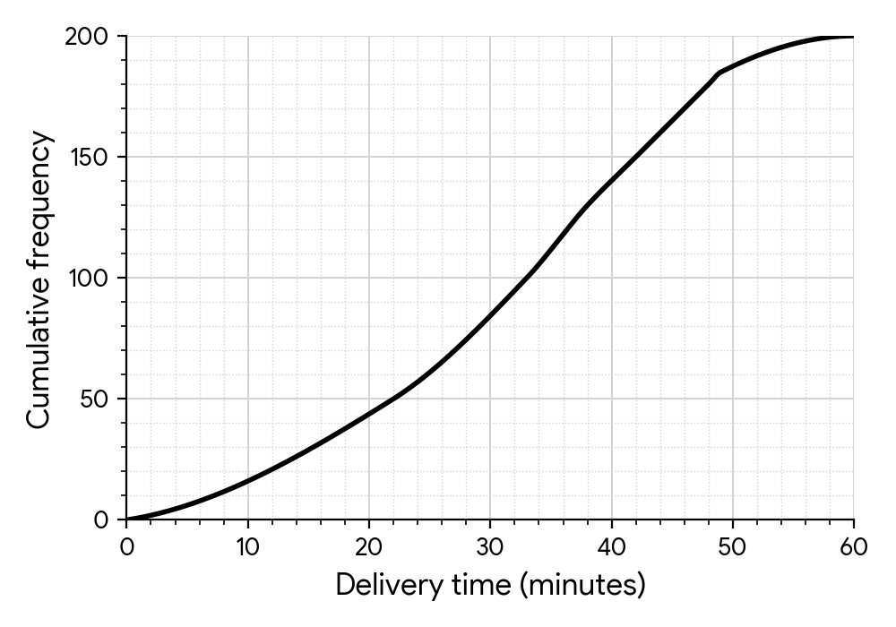
The horizontal axis represents the delivery time in minutes, from to . The vertical axis represents the cumulative frequency (number of deliveries), from to . The curve starts at and ends at . Key points on the curve are approximately:
(a) State the total number of deliveries recorded.
(b) Determine the median delivery time.
(c) Show that the interquartile range for the delivery times is minutes.
(d) Find the number of deliveries that took more than minutes.
(e) A customer complains that their delivery took minutes. Would this delivery be in the th percentile or higher? Justify your answer.
(f) The delivery service aims to complete deliveries within a certain time limit, minutes. Use the diagram to find the value of .
Look at the maximum value on the cumulative frequency axis.
The median corresponds to the th percentile of the data. Find of the total number of deliveries and then read the corresponding time from the diagram.
The interquartile range (IQR) is the difference between the upper quartile () and the lower quartile (). is at the th percentile and is at the th percentile.
First, find the cumulative frequency for deliveries that took minutes or less. Then, subtract this value from the total number of deliveries.
Calculate the cumulative frequency corresponding to the th percentile. Then, compare the delivery time of minutes with the time at the th percentile, or calculate the percentile rank for a -minute delivery.
Locate on the cumulative frequency axis and read the corresponding delivery time on the horizontal axis.
Question 17
MediumPaper 2 · calculator11 marksA group of students recorded the number of hours they spent studying for a mathematics test () and their corresponding test score (). The results for eight students are shown in the table below.
| Hours studied () | ||||||||
|---|---|---|---|---|---|---|---|---|
| Test score () |
On graph paper, draw a scatter diagram to represent this data. Use a scale of cm for unit on the -axis (starting from ) and cm for units on the -axis (starting from ).
By considering the scatter diagram, state the type of linear correlation that is shown in this example.
i Find the mean of the -values.
ii Find the mean of the -values.
iii Mark the point on the scatter diagram using the symbol .
Remember to label your axes clearly with the variable and units. Choose appropriate scales to ensure the data points are well-spread across the graph paper. Plot each point accurately.
Observe the general trend of the points on your scatter diagram. Do they tend to go up from left to right, down from left to right, or show no clear direction?
To find the mean of a set of values, sum all the values and then divide by the total number of values.
Apply the same method as for the -values: sum all the -values and divide by the total count.
Locate the coordinates you calculated in parts (c.i) and (c.ii) on your scatter diagram and mark it with the specified symbol.
Question 18
MediumPaper 2 · calculator13 marksA group of students participated in a puzzle-solving challenge. The time, , in minutes, taken by each student to complete the puzzle was recorded and grouped into the following frequency table.
| Time, (minutes) | |||||
|---|---|---|---|---|---|
| Frequency |
State the total number of students who participated in the puzzle challenge.
Identify the modal class interval and state its midpoint.
Calculate an estimate for the mean time taken to complete the puzzle.
Calculate an estimate for the standard deviation of the time taken to complete the puzzle.
The competition organizer initially estimated the median time to be minutes. Find a more precise estimate for the median time by considering its position within the interval it belongs to. Give your answer to the nearest integer.
To find the total number of students, sum all the frequencies in the table.
The modal class is the interval with the highest frequency. The midpoint is the average of the lower and upper bounds of that interval.
For grouped data, the mean is estimated by using the midpoint of each class interval. The formula is , where is the frequency and is the midpoint.
The formula for the estimated standard deviation for grouped data is . You will need the midpoints and the mean calculated in part (c.i).
The median position is , where is the total frequency. Use linear interpolation: Median , where is the lower boundary of the median class, is the cumulative frequency before the median class, is the frequency of the median class, and is the class width.
Question 19
MediumPaper 2 · calculator11 marksA tech company launched a new mobile application and collected customer satisfaction ratings from users. The ratings were on a scale of (very dissatisfied) to (very satisfied). The discrete data showing the ratings is given in the table below.
Rating | | | | |
---|---|---|---|---
Frequency | | | | |
Sketch a bar chart to represent this data.
For this data find:
i the mode
ii the median
iii the mean.
Explain any similarities between the answers to parts b(ii) and b(iii) by referring to a geometrical property of the bar chart drawn in part (a).
Remember to label your axes clearly and ensure the bars are of equal width and separated, as the data is discrete.
The mode is the value that appears most frequently in the dataset.
The median is the middle value when the data is arranged in order. Since there are data points, the median is the average of the and values.
The mean is calculated by summing the product of each rating and its frequency, then dividing by the total number of ratings.
Consider the shape of the bar chart you sketched. What does it look like, and how does that relate to the central tendency measures?
Question 20
MediumPaper 2 · calculator8 marksA local library organized a 'Summer Reading Challenge' for high school students. The number of books read by 60 participating students over the summer is recorded below:
(a) Tabulate the results in a frequency table and describe the frequency distribution.
(b) Calculate the mean number of books read and the standard deviation.
For tabulation, count how many times each number of books appears. For description, comment on the most frequent value (mode) and the general shape of the distribution (e.g., skewed).
To calculate the mean, sum all the values and divide by the total number of students. For the standard deviation, use the formula or . You can use your GDC for these calculations.
No question on this page matches those filters. Try another difficulty or paper.
2 more Presentation of data (frequency distribution tables, histograms, box & whisker, cumulative frequency graphs + finding median quartiles, percentiles, range, iqr) questions in the app
Every answer is marked mark by mark, IB-style, and the AI tutor helps when you are stuck.
Where marks are lost
- Copying a value wrongly out of the question. Costs the first mark of the part.
- Using your own wrong value after failing a "show that".
- Not simplifying where simplification is required. left unsimplified costs the A mark; does not. The rule is specific and asymmetric.